As far as I know, the Card Retrievability graph is more or less set in stone.
It’s a bit a shame knowing that the 0-70% range is I think, most of the time, useless, and having all the cards in buckets of 5% doesn’t give much information.
Could be interesting to limit the domain to subranges like [Desired Retention,100], [Min R, 100], or even a simple [70,100] with predefined steps. But right now [0,100] just feel useless
To me, having the graph be different every time you look at it would be aggravating. The Stats graphs are useful for at-a-glance, visual comparison. Changing the scale by happenstance makes them harder to use.
I’m also not sure how more granularity would be productive on this graph. If you need specifics, you’ll have to search in Browse anyway. Why not just get that there?
It’s not useless though. That’s where overdue cards will show up!
Overdue cards make more sense to be checked in a time-relative graph, like “Future Due”. In this view, with a DR of 83%, how do I even know what is in [80,85] but <83% or >83 ? It’s not the goal.
Changing scale based on data is precisely how all the others graphs function. You just don’t arbitrary decide “Reviews” y-axis will be “500 max” if the user is doing 50 reviews/days.
What kind of at-a-glance, visual comparison do you get by having for DR=83%, three bars relatively similar and a fourth one only representing the fact that my DR is somewhere in between ? Moreso, DR might be different for different decks and that view is not meant to be deck-specific, so right you can’t really anything out of it.
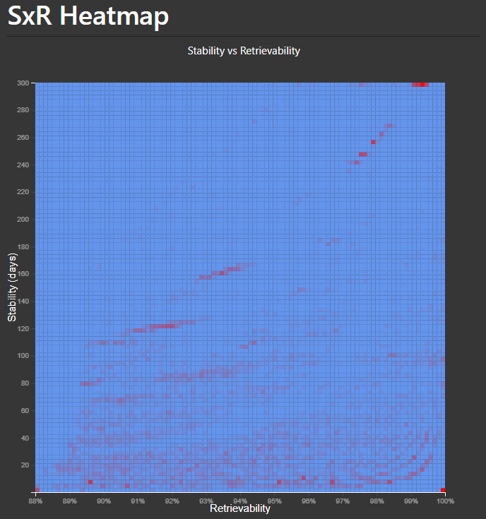
In ideal world, a better representation would be some kind of heatmap showing both the Retrieavibility distribution AND the Stability repartition, to see if your 95-100% are not just full of very low stability one. But this would require additional modifications, which would not really be quick-wins.
You get the rough distribution of your cards between 83% and 100% – which is where they should be. It tells you more than your avg. R of 92%, but that is useful too. Those 2 things combined tell you that your R is on track with your expectations.
It also tells you that you have some R-below-80 and below-60 cards that you might want to look into. [Your new screenshot helpfully demonstrates the utility of that 0-70 range.] Are those faster-falling shorter-interval cards? Siblings delayed due to burying? Or cards that have been missed somehow and need to be studied?
But still – there’s nothing you can do here except for knowing they exist. If you’re concerned about that partial bar at 80-85 – click it. Sort the Browse window by R to see what’s below 83.
I wish those graphs worked the same way as the other graphs like Stability and Intervals. With those, the graphs automatically zoom in/out depending on the range of cards.
With both Difficulty and Retrievability, it just shows the absolute range no matter what. If I filter by cards due, and all of them are above 95% difficulty, it just shows one big bar and the rest of the graph is blank. It’d be better if it zoomed to the min/max range.
There’s a pretty big difference between graphs that go from 0 to number-of-days-determined-by-the-information-being-shown – like Review Intervals and Card Stability – and graphs that go from 0% to 100%. Removing an arbitrary part of a 0-100% scale would be like leaving out the empty hours of the day on the Hourly Breakdown graph. Part of what is valuable in the graph is comparing the data to a defined existing scale.
@Danika_Dakika I mean, if someone literally only studied between 3 pm and 5 pm and had no data anywhere else in the day, they might want a higher resolution on that graph too. That’s just probably a very rare occurrence.
With Retrievability and Difficulty, it happens all the time and it’s frustrating. This graph is decidedly not helpful to me:
It seems like this is the crux of it. I agree – that graph isn’t helpful to you. But that doesn’t necessarily mean a different version of the graph would be.
It seems like Difficulty doesn’t really distinguish any of your cards. FSRS has made the determination here that D is basically a constant in your scheduling. I can’t see what useful information you get out of seeing at-a-glance how many cards are a hair higher or lower than that constant. They will all be scheduled basically the same.
You can sort them quite easily in Browse, but again – D is a non-entity so it doesn’t make much sense to be sorting by it, in Browse or in your study session.
[Have you looked at the D values in Browse by the way? Is there even any variation? Or are you asking for a more zoomed in graph where you’ll still have just one bar? ]
You don’t have to agree with me [you asked for my opinion, after all] – and I’m not saying no one will take this up and want to implement something to help with this request. [Are you sure there isn’t something like this in Search Stats Extended already?] But if someone does, hopefully they will maintain the mindset that graphical representations of data should be a meaningful distillation of the data. Too much detail usually gets in the way of that.
Yes actually. The numbers that display when you browse don’t show enough significant figures for you to notice a difference, but if you filter by prop:d>0.965, prop:d>0.966, and prop:d>0.967, those filters will all give you different results. Difficulty is being calculated beyond what is displayed and it’s a very useful sorting method, as all our sims last year discovered.
So no, a zoomed in graph would not still just show one bar.
This is definitely not true. D doesn’t mean “difficulty” in the way that’s intuitive, sure. It’s basically a lapse rating. Cards that have the most lapses have the highest difficulty. Considering that a lot of people suspend their leach cards, a lapse rating is useful to a lot of us.
If you sort cards by Easy first, you’re deprioritizing the cards that have the most lapses. It’s actually a great sorting method.
Have you stumbled upon that correlation in your own collection (with your history and parameters)? Apparently it’s not universal – because that’s not what I see when I look at Difficulty and Lapses side-by-side.