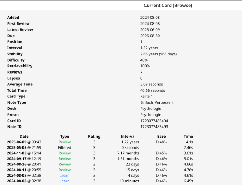
The blue row is only shown on hover (I took the color from dae’s profile picture).
The revlog (second) table should look more like the first (regarding the borders and maybe text alignment as well).
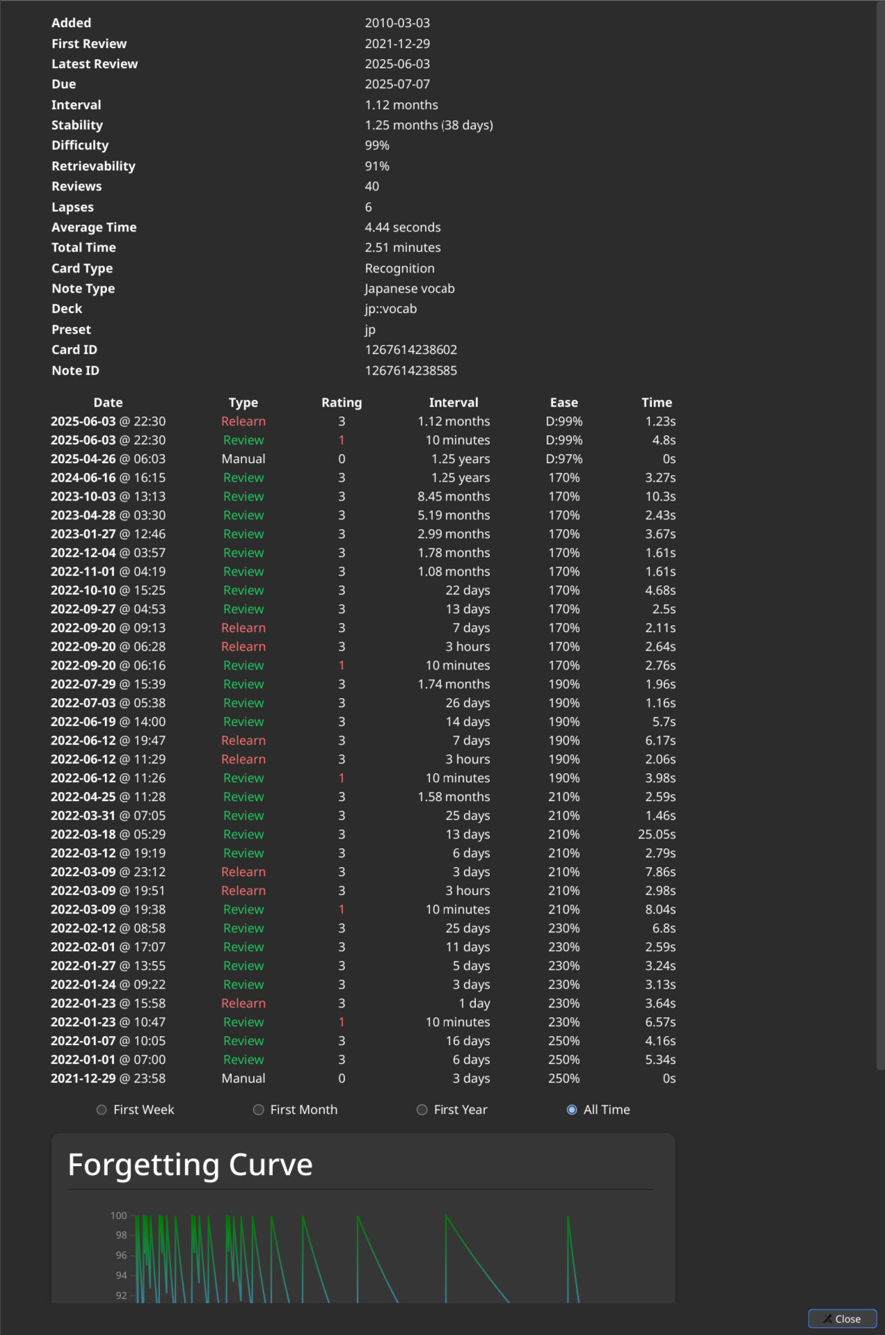
The styles are largely copied from the deck options screen. See CSS below.
Blockers
I’ve got a working prototype, but to make this work properly I’d have to modify the html code. This is the only way I see to make the styling better, which in this case actually means making the styling consistent.
E.g. the second “table” (revlog) doesn’t apply the dashed border like in the first table. The reason is that the revlog table consists of a lot of divs, rather than an actual html table.
This means dae might not accept it.
ToDos (in case changes were accepted)
Fix card stats table, so that it could be centered, if desired.
Fix revlog “table”, to make it an actual html table (which would fix the styling, which is way off currently).
CSS
I don’t have a PR for you to test. But if you use the dev console addon, you can add the following css to achieve my proposed design:
/* TABLE AT THE TOP (CardStats.svelte) */
:root {
--anki-color: #01bcff;
}
.row {
margin-bottom: 2rem;
justify-content: center;
overflow:hidden; /* Hack. Wrapping the table around a second div would be better. Needed, because the dashed lines otherwise overflow. */
/* Styles below have been copied from the deck options styles */
box-shadow: 0 3px 3px -2px #14141433, 0 3px 4px #14141424, 0 1px 8px #1414141f;
background: var(--canvas-elevated);
border: 1px solid var(--border-subtle);
border-radius: var(--border-radius-medium, 10px);
padding: 1rem 1.75rem 0.75rem 1.25rem;
}
.stats-table {
margin: 1.5rem 2.5rem;
border-collapse: separate;
}
th, td {
padding: 0.25em 0;
}
tr:hover {
background-color: var(--anki-color);
}
tr:nth-child(4n):not(:last-child) {
border-bottom: 2px dashed #ccc;
}
/* TABLE IN THE MIDDLE (Revlog.svelte) */
/*
* Note: This isn't a real table, just a bunch of divs that look like a table.
* This does break styling though. If this change would be accepted, and dae
* would accept rewriting the divs into a table, the styling issues will be
* fixed. It was supposed to look like the first table.
*/
.revlog-table {
margin: 1.5rem 2.5rem;
}
.column-content, .column-content > div {
padding: 0.25em 0;
}
.column-content > div:hover {
background-color: var(--anki-color);
}
.column-content > div:nth-child(4n):not(:last-child) {
border-bottom: 2px dashed #ccc;
}
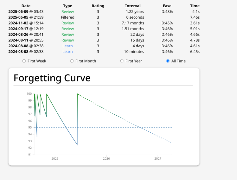
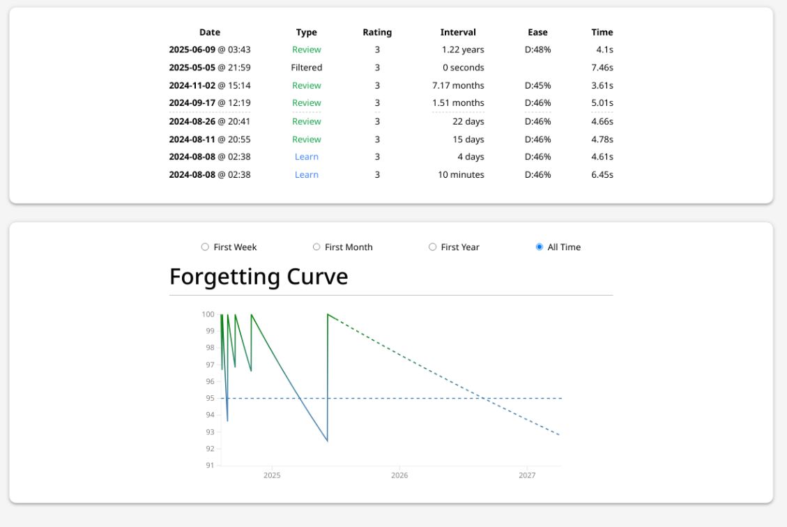
/* FORGETTING CURVE AT THE BOTTOM (ForgettingCurve.svelte) */
.forgetting-curve {
margin: 1.5rem 2.5rem !important;
}
.forgetting-curve > div.container {
box-shadow: none !important;
border: 0;
border-radius: initial;
padding: 0;
}
The highlighting/emphasis lines seem strange to me.
I don’t know what purpose is served by having the blue-on-hover in the top info. [I expect you could find a color that blends better with the interface – maybe the hover-color from the menus or the Decks list? Or something from Stats?]
Similarly, I don’t know what purpose is served by having the dotted underline in the revlog section. [Is that also on-hover?]
The division of the top info into sections/bands seems to be done haphazardly. I’m not sure it’s necessary at all, but if it’s going to be happen, the divisions should make sense (i.e., like with like).
As far as everything else – I don’t know what is gained by making this page prettier or more animated, since it’s in the “most users will never see it” category. But if it doesn’t hurt anything [make sure it works well with Reduce motion, Minimalist mode, and Dark Theme] and it doesn’t make support more difficult, I’ll just be “meh” about it.
I think max-height is useful for the revlog table, given there’s forgetting curve after it now. If you have too many reviews (which some of us do, think filtered reviews), this takes too much space.
I think that could be great from a usability perspective. But it might make things more difficult for support (users are sometimes asked to make screenshots of this list). I’m assuming there’s more margin for error, if users for some reason don’t realize it’s scrollable.
I just don’t want to work on something that’ll be rejected anyways. So far, this topic received 3 votes against and 0 votes for the changes (or similar changes) I proposed.
But if there’s some demand in the future, I’d gladly pick this up.
Another potential issue with the card info window is cards with a really long history. It’s quite annoying having to scroll down pages every time I want to see the chart.
Some discussion here, before I knew about this thread. I think a more general solution is better than my proposed “fix”.
A scrollable container within a scrollable page doesn’t seem like it’d be pleasant to use. Perhaps an alternative would be to crop the revlog and add “Show more” at the bottom to expand it fully
Anything that makes it harder to get a screenshot of the entire review history would be a hassle for support. It’s already hard enough to get complete information sometimes from mobile users on small screens (who have the fewer-columns version of the revlog in portrait). If I know that’s what’s coming, I can at least ask – “Take the screenshots in landscape mode if you’re on a small screen” – but they hardly ever do.
I think a “Show more” button would be a similar hurdle. Suddenly, “Show us the Card Info for this card” – turns into “Show us the Card Info for this card (except we don’t need the graph), but before you take a screenshot, click show more until it stops doing anything/goes away …”
I know some people love that graph though – so, just brainstorming some other options –
Add a jumplink/anchorlink to scroll to the graph. Either put it between the top info and revlog, or better yet, save the screen space and make the “Retrievability” line in the top info be the link to the graph.
[Jumping off from Damien’s idea of “make the sections collapsible, and remember the previous state”] Make just the graph collapsible, and you could put it in the middle (between the top info and revlog), but only if it is always collapsed on open – i.e. don’t remember the previous state.
Aside from clipboard restrictions, we need it to be readable when posted/shared in a variety of places. If it collapses from a nice table into a pile of text, it makes support work that much harder. Since I’ve never found any use in having it in text form (unlike card templates or FSRS parameters, for instance), screenshots satisfy that need pretty well – as long as we can get what we need on the screen!

 and make the “Retrievability” line in the top info be the link to the graph.