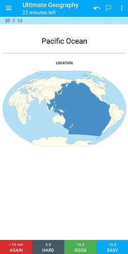
Have you ever accidentally tapped another answer button when using anki on your smartphone?
Therefore, I programmed a mode to temporarily narrow down the answer button to two, assuming a situation where there are many tap mistakes such as when wearing gloves.
The functionality is already complete, but it’s a bit different from the original anki UI, so the actual implementation requires community feedback.
- Provides an option to hide the Hard and Easy buttons to prevent accidental taps.
- This option does not change any behavior other than the above.
I welcome the opinions of the community.


