This is just a reminder for myself, so that I do not forget about it. I’d like to work on these things in the coming weeks and will open PRs once ready.
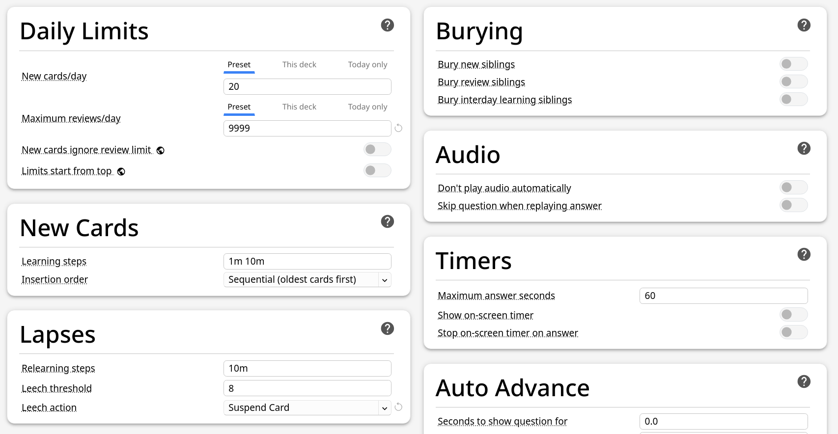
Investigate good ways for affordances (making it obvious that the links are clickable). Desktop anki might benefit from this change as well, since a lot of users had no idea the strings were clickable (according to a poll from, I believe, @Expertium) Edit: Rejected by dae in [Reminder for myself] Improve A11Y in the deck options - #25 by dae
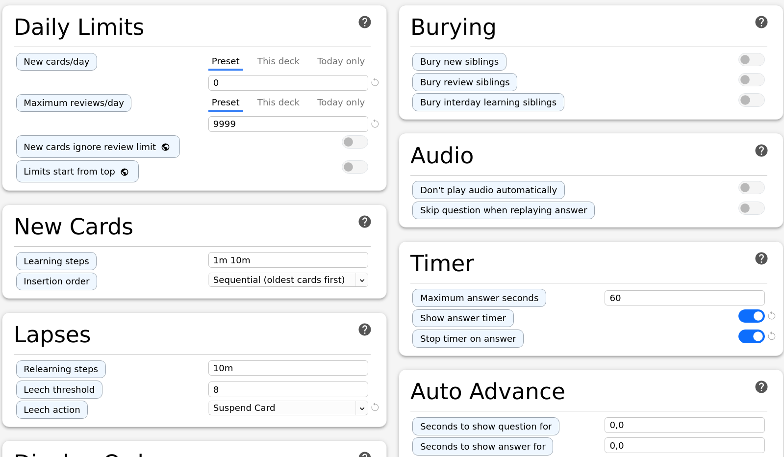
Tweak the question mark / help icon in deck options to make it easier to find.
Things like New cards/day have spin-boxes, that show spinners to increment / decrement the values. Do they have to have a minimum touch target of 48px as well? Or only the spin-box itself?
Edit: I also might need your help to test if the reset button solution works, once I open a PR.
What I mentioned were Android-specific guidelines, and there are exceptions and caveats [I believe iOS uses 44px]. You’d want to check WCAG to see how/whether the guidelines differ when using a keyboard & mouse.
We can, and probably should move a lot of these fixes to be touch-only, as they will lead to lower information density on the screen
Tapping on the input text opens the standard Android input for numeric text, and we have a custom up/down stepper which we could use
The up/down arrows on New Cards/day aren’t currently visible on my alpha of AnkiDroid (~25.06b6; Tablet; emulated on my MacBook), so I wouldn’t worry about it. Accessibility guidelines are typically win-win, as they help avoid misclicks, but given there’s multiple ways to modify the numeric inputs, I would focus on more pressing issues.
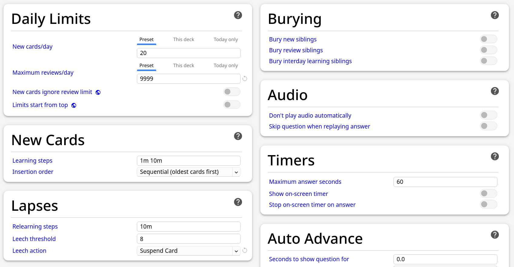
I like the underlined text which occurs when someone hovers over the option names, and would check whether making this always visible on mobile would resolve the issue.
For contrast: see if it makes sense (using the WCAG contrast checker), or whether the automated tool is mistaken
The color is set by --fg-subtle and is #737373. I could change the variable, but that would change every element that uses this variable. I could also replace the variable with the color of the “swtich thumb”, which would look like this:
I faintly remember pushing a PR because there was a language where characters were stacking and thus changing the needed line-height.
I assume if I set the line lower, there will still be languages were it causes problems, then. Using the blue color to indicate a link looks quite bad though.
Affordance clearly is more complicated then expected. Especially since styling the strings as buttons would make it look out of place.
What else could we use? text-decoration cannot be used, color might look very out of place, box-shadow looks weird too.
Something like this looks clickable, but out of place too: