Yellow is a hue that grabs attention very easily so it isn’t fit to be a good inactive colour. It is distracting and not subtle enough (so when I’m reviewing very fast I sometimes end up guessing an inactive mask).
The most common form of colour blindness (around 8% men) usually affect how you see the colour red, so it would be better to use a different colour than red. Red is also (IMO) harsh in that it is used more in warning signs etc.
Anki will also natively implement “inactive” clozes so the colours used for IO should ideally match with colours used in clozes.
Here’s what I suggest:
Gray (inactive) for a subtle colour that isn’t distracting.
Blue (active) as it’s already used for cloze cards.
Poll
NOTE: THE COLOURS WILL ONLY CHANGE FOR NEW USERS.
Use blue/gray
Use red/yellow (current default)
Other
0voters
Suggest in replies if you have better ideas for what colours to choose.
I think having a maximal contrast is going to make it pop and your eyes will naturally see it first. But that’s just a theory.
As for the HTML/CSS, why are we limited to those? The IO editor already has complex features like drawing polygons, which I doubt was made using only HTML and CSS.
My idea is we only change the template the IO note type comes with, which means the change is simple and easy to implement. Plus, users can easily change the colours from the template. And your idea would require more work, and I’m not sure anyone will take that as a priority.
You’re essentially suggesting we remove whatever is in the background, or we use the colour already used for the background. The first one needs some complex AI (like magic erasers that some smartphone companies are doing). The second one won’t work when you have mix of multiple colours around the inactive mask.
I agree with using gray for inactive masks but I think the blue which we use for cloze is too bright for masks, it would hurt people’s eyes so instead a different shade of blue would be a better choice. I initially wanted to suggest using black for active IO but using black for active IO creates another problem when it comes to dark mode so I think a different shade of blue would be a better choice (one that doesn’t hurt the eyes).
And what’s with the mask’s colors appearing less bright than they should?
Hey, a few thoughts on the history behind the colors and other past design choices (with the caveat that that this was ≈10 years back):
I used a red hue for the answer mask in IOE both because it was used in earlier implementations of IO and because it made sense to me from a UX standpoint:
Images can be harder to parse visually compared to text, and so using a signal color like red (compared to cloze blue) seemed like a good way to ensure that the masks would be easy to locate quickly in more busy images.
Similarly, while users typically control the text they enter into Anki, in most cases they have no control over the content or background colors of the images they add. So it’s important to go with a default that is likely to remain visible across the widest variety of images without requiring per-image adjustments. A red hue seemed like a good safe choice there. FWIW, I did however end up switching to a more desaturated red to make it more friendly. Definitely agree with your point there that red can be harsh.
Yellow for inactive masks came to be for two reasons:
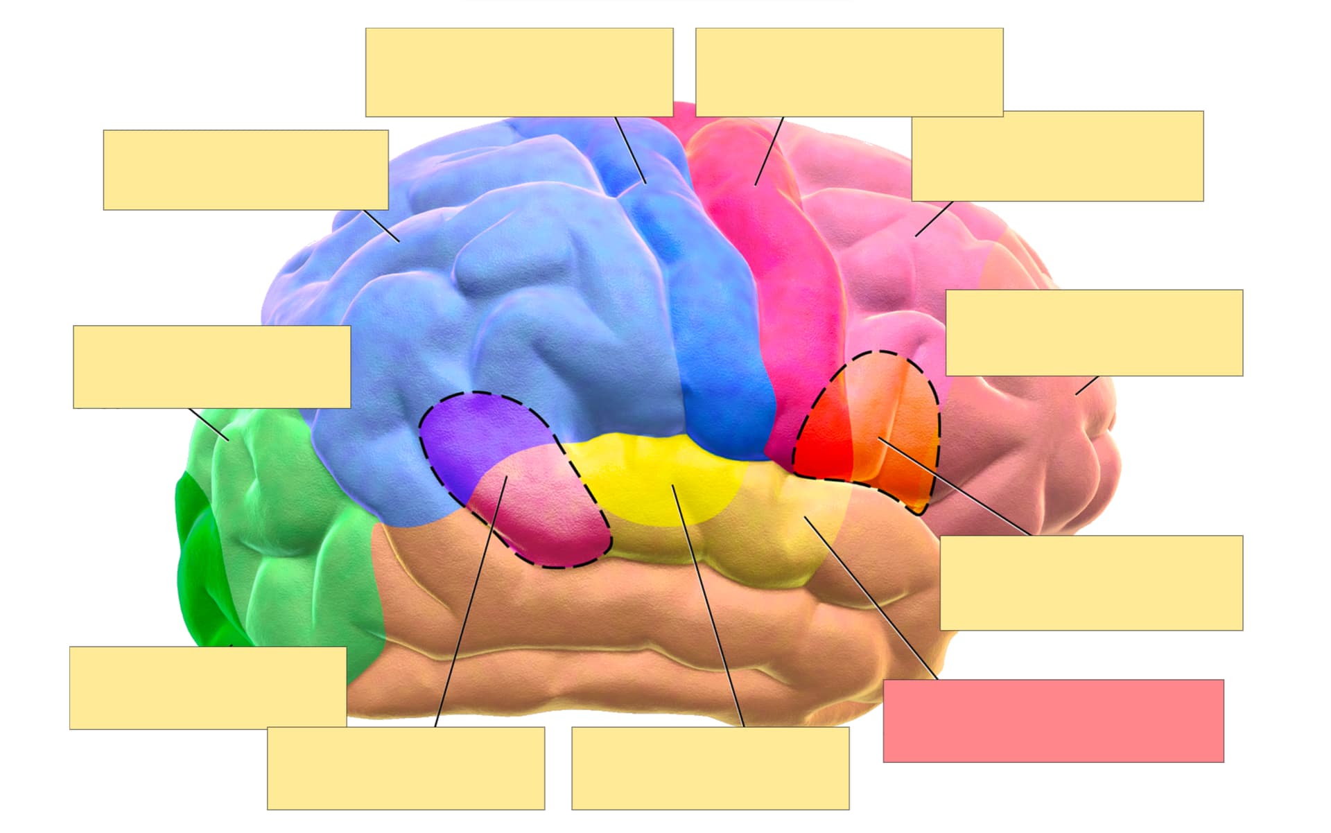
Earlier IO implementations had used borderless white shapes for inactive masks like in the image below:
I found that, during note creation, this made it difficult to tell which areas of an image I had already occluded and which might simply be missing labels. The same, albeit to a lesser degree, also applied to reviewing cards, as it can be helpful to have an idea of the inactive items there as well.
I went with yellow as the color to replace white as it had good contrast with red and reminded me of physical sticky notes which I had used to do IO in real life in the past
I added borders to all masks for two reasons:
To have a WYSIWYG experience between adding/editing masks and reviewing them: Pretty much exactly as @ZornHadNoChoice said, borders are important in the editor as they allow users to easily visually distinguish masks, both against the base image and when shapes overlap. However, enabling them only when editing cards could be surprising to users. So we use borders across editing and reviewing to make things more consistent and intuitive.
To also make masks more visually distinct against the base image when reviewing. Although unlikely with red/yellow, there could still be cases where masks collide with background colors in the base image, so having a neutral black/gray colored border would allow the masks to continue being identifiable even in edge cases like that.
Some thoughts on the current proposal:
Inactive masks
I think you make a great point there and, now that I think of it, I’m pretty sure that this is something I’ve run into myself every now and then. I find that yellow works well when all labels on an image are occluded because there is a clear contrast between tested and non-tested areas. But the sparser the masking and the more labels unmasked, the more likely it is that inactive shapes draw more attention than they should.
That said, from an aesthetics and contrast standpoint, I’m not that fond of the current shade gray as the inactive color choice.
Active masks
I would still have a preference here towards a stronger signal hue color like red for the aforementioned reasons.
However, I think your focus on accessibility is great and something we should definitely make sure we get right on any change of the defaults. FWIW, very early iterations of IOE actually briefly used red/green as the mask colors. I switched away from that quickly as you might imagine. At the time, red/yellow seemed like an OK choice for deuteranomaly, which is the most common form of color blindness. However, looking at a color blindness simulator like this one, it’s definitely not great.
FWIW, I don’t remember IOE ever receiving any feedback or bug reports in regards to the red/yellow choices and accessibility issues, but reported issues are not necessarily representative of actual issues. There could be many reasons why reports on this never came through, e.g. users tackling adjusting the color choices on their end. If we can avoid that need through better defaults, I am all for it.
I also like how a blue hue would introduce more visual consistency between text and image clozes, but all else being equal, would weigh visual parseability of the card higher than in-app consistency.
To throw a set of alternate/iterative suggestions into the mix then:
For inactive masks, I would propose that we use a softer shade of white while retaining the border. This should maintain sufficient contrast with the base image, give a more modern appearance, and provide a stronger cue to help distinguish active from inactive shapes.
Inactive masks need to be more easily distinguishable during mask creation than reviewing, which might be encouraging us to use stronger colors for inactive masks than we should. So should we find that these lighter inactive mask colors reduce usability during mask creation, I would propose that we consider using the active mask color instead rather than making the inactive one more attention-grabbing.
For active masks, we could then use either the existing red or dodgerblue. Both would contrast well with white-ish inactive mask, but we’d need to balance trade-offs in terms of usability for different user groups:
Red: In my opinion, red provides stronger visual separation of masks from image content for most users and aligns with the millions of existing IO cards out there, the value of which we should not underestimate. From an accessibility perspective, looking at the color blindness simulator linked above, it likely performs better than the current color combination but is less accessible than a blue-based color scheme in most forms of color-blindness.
For inactive masks when using red for active ones, I would propose “ivory” as shade of white. This has a subtle yellow tint and thus offers a gentler transition from the current configuration while still significantly improving accessibility and reducing visual emphasis on inactive masks.
Blue: Offers better accessibility for users with color blindness and is more consistent with text clozes, which could help with card parsing by always signalling the tested item. However, in my opinion switching to blue could have an impact on visual search time for users overall as it may be harder to separate from busy or larger images with arbitrary content.
For inactive masks when using blue for active ones, I would suggest that we stick with a neutral shade of white, same as your proposal. However, I think we should go with a much lighter shade here, e.g. “whitesmoke” or even lighter than that.
Here is a table comparing all designs across the current state, the current proposal, and the two alternate variants:
* this is just a simulation of one form of color blindness (deuteranomaly), for other forms see this simulator for instance, but note that even within particular forms there can be a wide spectrum of color sensitivity differences
I think that a new poll could be helpful, but it’s important to keep its limits in mind. Right now, 11 Anki users who happened to find this thread (including me) are weighing in on changing a default that’s been in place for 10 years, is almost as iconic to Anki as clozes being blue, and, like all card template changes, isn’t easy to undo.
That’s a good point and is definitely an issue we would have to think about. Mask colors in the editor live separately from template settings. If we switch defaults, we will either have to adjust the mask editor to dynamically use template colors or we end up in a situation where a large group of users will see different representations of the masks in the editor vs. card rendering (if we stick with the PR as is, the old colors would appear for cards with the updated template. If we update the PR to change editor colors, old cards would suddenly show up with the new colors in the editor. Neither are ideal of course).
One other point of consideration is that if Anki fails to meet a11y needs, we would also have less users with a11y needs. So we should just be looking at simulations.
I’m totally fine with that, I used lightgray to provide more contrast with the background because I thought others would want that (plus, I’d have hated doing another poll). Given there will be black borders it’ll probably be fine.
FWIW, there’s a new colour fill tool so people can change colours per IO card.
I do appreciate the wider argument for red, it matches with older IOE cards, and it pops out more easily. But A11Y to me is a bigger concern. If you just look at the population, there are 4x more colour-blind (red/green) people than there are Germans on earth. And this particular form seems to reduce red/white contrast.
I’ll look into it. But honestly, polls seem like a substitution for real discussion. It’s better if people just chime in with their opinions if they have any. I did this one only because dae asked for one.
I made two custom classes for my mockup, i.e. those are not Anki masks but divs absolutely positioned with hardcoded widthes/heights. I assume in the Anki code, the devs can apply different styles to active and inactive masks.
IMO, keep ‘active’ a red shade. Remember that most users aren’t colorblind, so you are worsening the experience of approximately 95% of the users.
If you want to properly help colorblind people, use separate themes for colorblind people, like GitHub and the new statistics PR do, instead of trying to fit everyone in the same bucket.
Also, no blur. And rounded corners could work in the beginning of IO, but now some cards rely in the straight corners