Dear community,
Until now, UI colors have been introduced - and used - in a rather non-systematic way. Values were chosen without too much thought about the relation to other colors, variables like flag3-fg were used for elements that do not have anything to do with flags etc.
With PR #2016 I want to improve this situation. Over the summer, I’ve been working on integrating a fixed color palette with 10 shades for each color. The grays are custom-fitted to Anki, the colors are from Tailwind CSS.
Example:

In the future we will curate the set of global CSS variables (e.g. --flag-1) from that palette like this:

As a result, all previously used colors and most gray tones will change.
To make sure these changes are for the better, I invite you to share your thoughts about the old themes, my current proposals and how we can improve them. My current plan is to stay conservative and make dark mode just a bit darker and light mode a teeny-weeny bit lighter. Once we got a solid system to support more than two official themes, we can get more daring.
Gray Tones
These are the gray tones I picked through weeks of trial and error:

As you can see, this isn’t your everyday linear gradient - it’s quite the steep transition from light to dark tones, but relatively flat within the respective theme. This reflects the general idea of making light mode brighter and dark mode darker, but also smoothing transitions (=borders) within each theme.
Hex values
    gray: (
        0: #f4f4f4,
        1: #efefef,
        2: #e3e3e3,
        3: #d1d1d1,
        4: #919191,
        5: #3a3a3a,
        6: #2d2d2d,
        7: #2a2a2a,
        8: #252525,
        9: #181818,
    ),
Showcase
Here you can compare my changes to the the current main branch. The first screenshot is always from main, the one below from #2016.
Dark theme
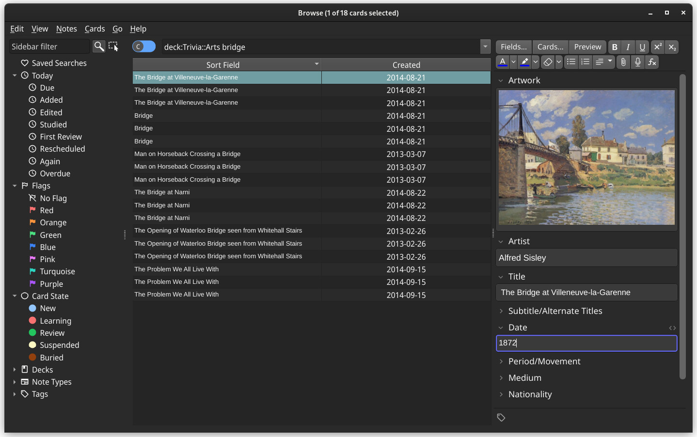
Browser

Other screens


What do you think about my proposed dark theme (lower screenshots)?
- Better than status quo
- Better than status quo, but too dark
- Better than status quo, but still too bright
- Worse than status quo
Light theme
These changes seem less significant to me. Background is a bit brighter and borders less harsh. Some of you surely got more capable monitors than me and can judge this better.
Browser


Other screens


What do you think about my proposed light theme (lower screenshots)?
- Better than status quo
- Better than status quo, but still too gray
- Worse than status quo
- I don’t notice any difference
I updated the browser screenshot with less saturated flag and card-view toggle colors one day after publishing this poll. If you already voted, please take a look at it again to check if your answer still applies.


