The 2.23 version of AnkiDroid (currently in alpha) features a new and improved study screen. This thread is intended to serve as the official location for feedback about it.
Bugs should be reported on GitHub.
If you like it and want to further contribute with its development, you can donate to help us maintain the work ![]() .
.


New features and improvements
- Performance
- It’s faster, lighter and more reliable
- Compatibility
- It uses the same shared style and rendering mechanism of Anki and AnkiMobile
- Now cards should work the same way among the platforms, which fixes persistence between front & back, and a lot of broken note types.
- There are minor style changes that are a consequence of that, like margin changes and the coloring of play buttons in dark mode.
- Gestures
- Compatible with buttons, controls, and other interactable elements in cards!
- New multi-finger gestures
- Immersive mode
- Better support for modern phones and newer Android versions
- Added option to hide the system’s status bar, navigation bar or both
- Added option to ignore the Display cutout
- Answer feedback
- Replaced the dot-based answer feedback with new icons
- Wrong answers are on the left, and the correct answers are on the right. That way, there is feedback about the answer without even looking at the indicator.
- It also helps indirectly explaining to the user that ‘Hard’ is a correct answer, which is a broad confusion point in the community.
- There’s also an option to disable it if you don’t want it.
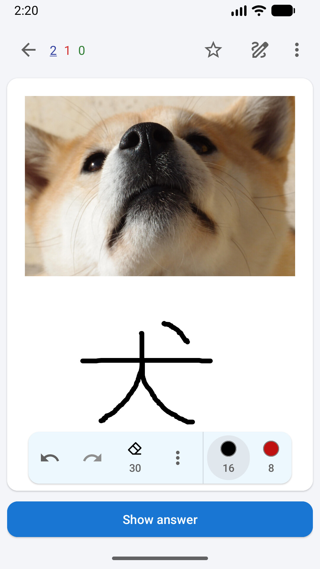
- New Whiteboard
- Custom brushes: you can save brushes with an specific color and size to easily re-use them in multiple cards
- Set custom toolbar position
- Ink and Stroke eraser modes
- Better stylus support
- Reformulated visuals
- It’s possible to restore the previous frame style, by changing it to the ˋBoxˋ option.
- Tablet/Foldable/Desktop dedicated design
- Toolbar
- More intuitive action selection
- Toolbar actions can be reordered
- Toolbar actions scroll if they don’t fit the screen.
- Added option to put it at the bottom of the screen
- Auto-advance
- Fixed behavior of not following the deck configuration when going to a different deck in the study screen.
- Type-in answer
- Improved support for the ˋHTMLˋ type-in input setting
- New ‘Browse’ and ‘Statistics’ commands
- quickly open other screens while studying
- Hide ‘Hard’ and ‘Easy’ buttons setting
Changed/Missing features
- The card counts and timer are now in the toolbar
- Flag and mark icons are in the screen top corners, just like Anki and AnkiMobile
- As an accessibility setting, the answer button size can only be made bigger, not smaller.
Can be add-ons
Won’t be back as native features, but can be implemented as JavaScript add-ons by the community
- Show deck title
- Also replaceable by adding ˋ{{Deck}}ˋ in the card template
- Show ETA
- Image Zoom
- Show large answer buttons
- Center align
Won’t be back
- Press back twice to go back/exit
- A setting like that is made to mitigate navigation problems within the app, but it shouldn’t be necessary. If that’s your case, please report your issue so we can take a look
- Answer buttons position > Top
- It is not ergonomic, and it is replaceable by gestures.
- (old) Text to Speech (TTS)
- It was replaced a long time ago with the Anki Ecossystem TTS system, and marked with a deprecation warning. It’s time to go. We will provide a guide on how to migrate.
What will happen with the old study screen?
It won’t get any new features, and only critical issues will be fixed.
Our current intention is to only remove the old study screen when most of its deprecated features and behaviors are implemented as add-ons in the new study screen by the community, so it doesn’t interfere with the users’ workflow.
But that may happen sooner if maintaining it becomes unsustainable,
Please remember that AnkiDroid is a free and open-source app, made by volunteers in their scarce free time. Keeping two screens with the same functionality isn’t sustainable in the long term, so the old study screen will eventually be gone.
Loved it? Any donation will help us improve even more the new study screen ![]() .
.
