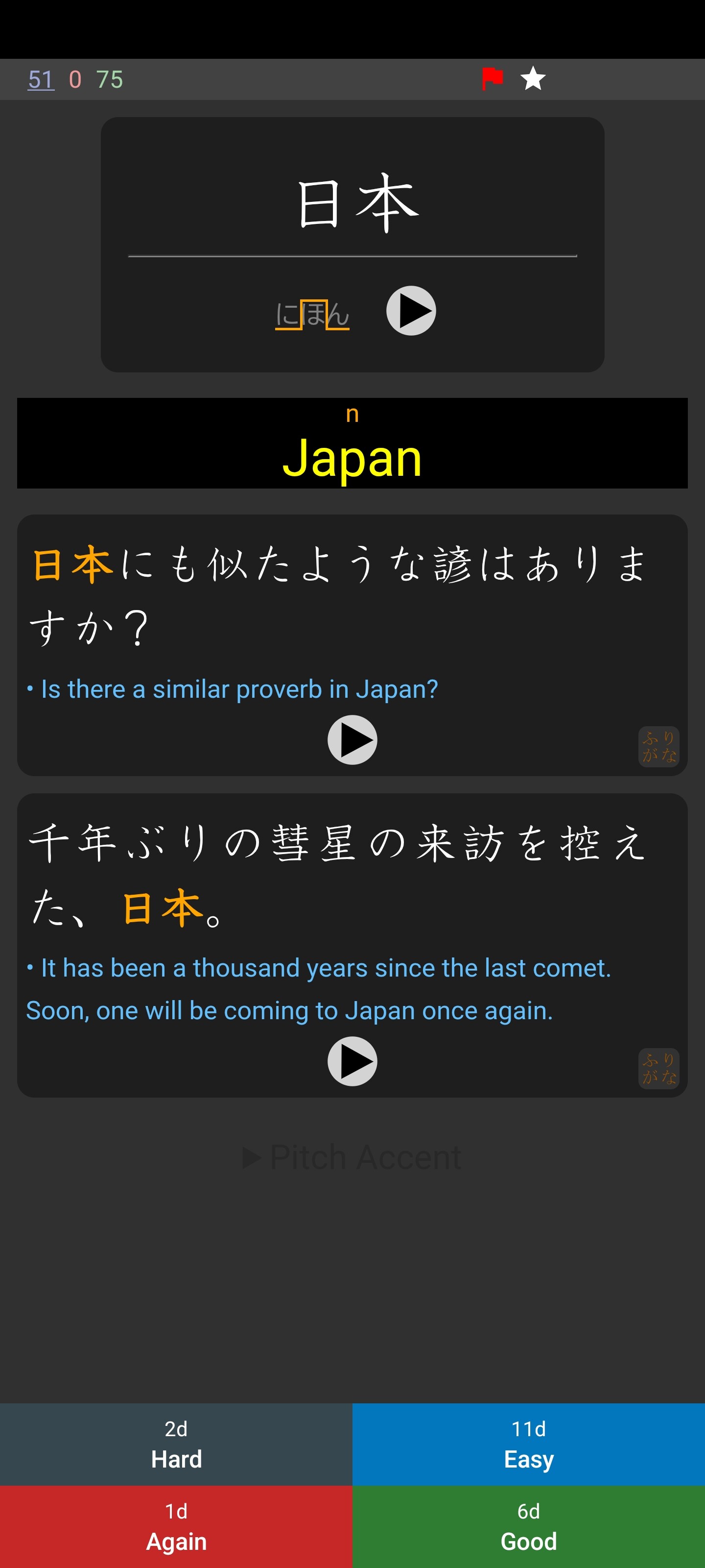
The play buttons have changed; they’re bigger and more grey. I guess bugger buttons help with accessibility, but the grey looks ugly in the “black” theme.
The “mark star” and the flag appear in the corners embedded in the card, this means that it’s possible that the card content overlaps them (in fact it happens in the front of the above cards). If it wasn’t for that, being in the corner looks better.
The option to have the answer buttons at the top is removed (I haven’t used that feature myself).
“Show large answer buttons” accessibility feature doesn’t work.
The answer buttons are colored in the “plain” theme.
“Answer button size” is bugged below 90% and the show answer button stays at 100% despite the answer buttons getting shorter.
I dislike the colors. I like the simplicity of the 2.20 AnkiDroid black theme buttons. Also, the text on these new answer buttons is less readable (I feel like this was intentional, to discourage looking at the intervals).
The colored dots indicating the previous rating are missing!!!
The navigation drawer is replaced with an arrow to go back to the deck screen. It looks weird next to the colorful numbers.
As you can see in the screenshots above, the frame style “box” has bigger margins. The more I look at the more I like the new margins despite it’s inefficiency.
Super cool to see so much excitement about the new reviewer, immediately - I mean, I just released that alpha today!
A quick note about desired vs non-desired feedback, from the developer (Brayan!) that’s been working on this new reviewer for such a long time:
Despite what the new section summary says, I still don’t want feedback about stuff that is obviously missing.
The main goal of implementing the new section right now is giving more time to translate the strings.
So, of course there are things obviously missing. It’s open source, so there’s no expectation they will ever even get finished, much less a commitment to a deadline. So if something is simply missing, not helpful feedback at the moment
However! If something is implemented but not working right, that is awesome feedback. And heading to crowdin (our translation site) to translate strings is always welcome.
Cheers! And kudos to Brayan for getting the feature this far along already
I’m sure you know, but there was always a label for not posting any bug reports about it as it was in development. Now it has been changed to “Available for testing and feedback”. So naturally, I assumed that you wanted “testing and feedback”.
I understand the amount of work you have to do (for free). I’m simple man I see bugs I report them. I’ll keep your points in mind.
Thanks for continuing to bring more amazing updates to AnkiDroid.
The old study screen fills the display cutout area with a black color that does not depend on the theme. The new study screen fills the area with a theme-specific color. This is very noticeable, especially in light themes. Since the display cutout has a dark color, the behavior of the old study screen is more correct.
For what it’s worth I thought your feedback was almost completely in the “very useful to know” category, just wanted to fine-tune it for anyone else that showed up since if feedback came in within just a couple hours it may blow up as a topic with a firehose of feedback
Maybe your phone has an “Infinity Display”. In my case, it looks like: a dark stripe, a white stripe inside which is a dark circle from the camera, a card. Before: dark stripe, card.
Style comes from Anki Desktop. Ask to change it there if you want.
It follows what Anki Desktop and Anki Mobile do for ecossytem compatibility. If you prefer the old style, you can tweak the HTML/CSS
Ecossystem compatibility.
As an accessibility setting, it doesn’t make sense to go below 100%, which is already the bare mininum touchable recommended area for Android. The answer buttons getting smaller is actually a bug.
The rest of the feedback is missing stuff about a developer option in the “Work in progress” category. Most I’ll implement, while some I won’t and it will be up to the other maintainers and developers to get them on or not (like the top position for the answer buttons, which I find unergonomic and doesn’t make sense to me.)
Probably a consequence of the gestures now being detected with JavaScript instead of detecting with native Android code.
That is necessary so it’s possible to tap/swipe buttons, <details> and other interactable elements in the screen, which are very used in some note types.
So, you have a phone with a notch (probably a black notch) and want the status bar to be black?
I’ll try to think about something. I already planned to make some JS API methods to tweak some “Android native” elements of the screen.
Maybe a Style sections in the settings would work (without having to use the JS API). But I won’t work on it anytime soon, and there’s the chance of delegating to someone else.
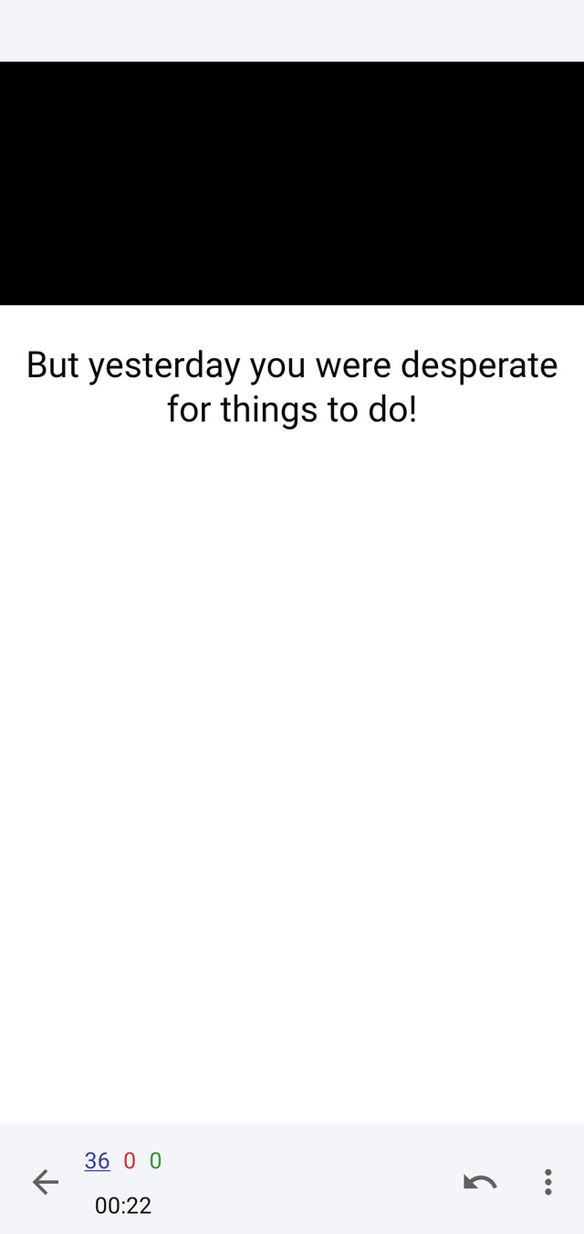
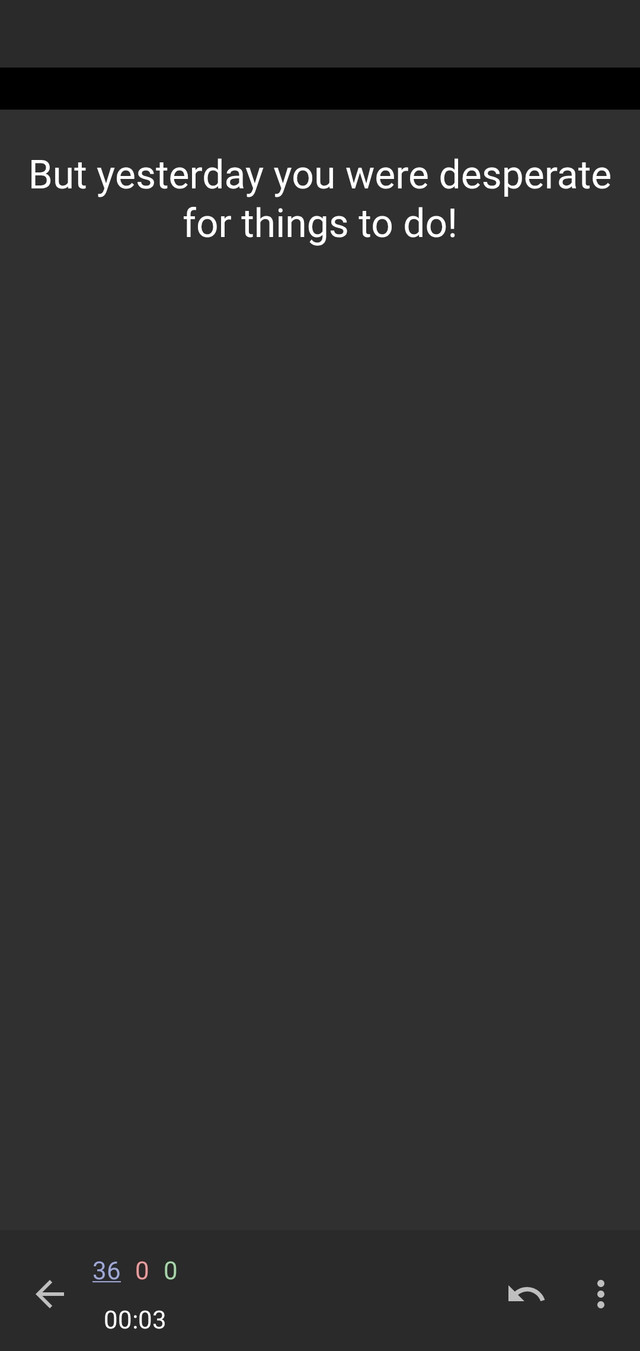
I noticed a strange scaling of the image when I move the phone to the horizontal position. I can’t demonstrate, because when I try to create a card for demonstration, ankidroid closes without notifying the error.
Are you using the beta version, because there is a bug that doesn’t let you use the gallery to attach images.
I tried replicating the issue but couldn’t do it. Can you give more details? You can copy an image from a website to your clipboard then paste it in the Front field of a basic card, then see if the bug happens.
I see. That’s how it has always been. Either the image has a set width or its width is less than the length of your phone.
Edit: Yup. I just checked, and in the old reviewer, Images enlarge to fit the screen width (or height if in landscape mode). The new reviewer has the behavior of keeping the image as it is.