Aside from there still being no user-focused reason to make a change at all …
This seems wrong to me from a right-handed-design/right-thumb/mouse-user perspective. When there are right-aligned buttons in a UI, those are usually primary, aren’t they? Even though the other buttons in this section are left-aligned, it still seems like right-aligning this one gives it prominence – lined up so nicely right under those switches.
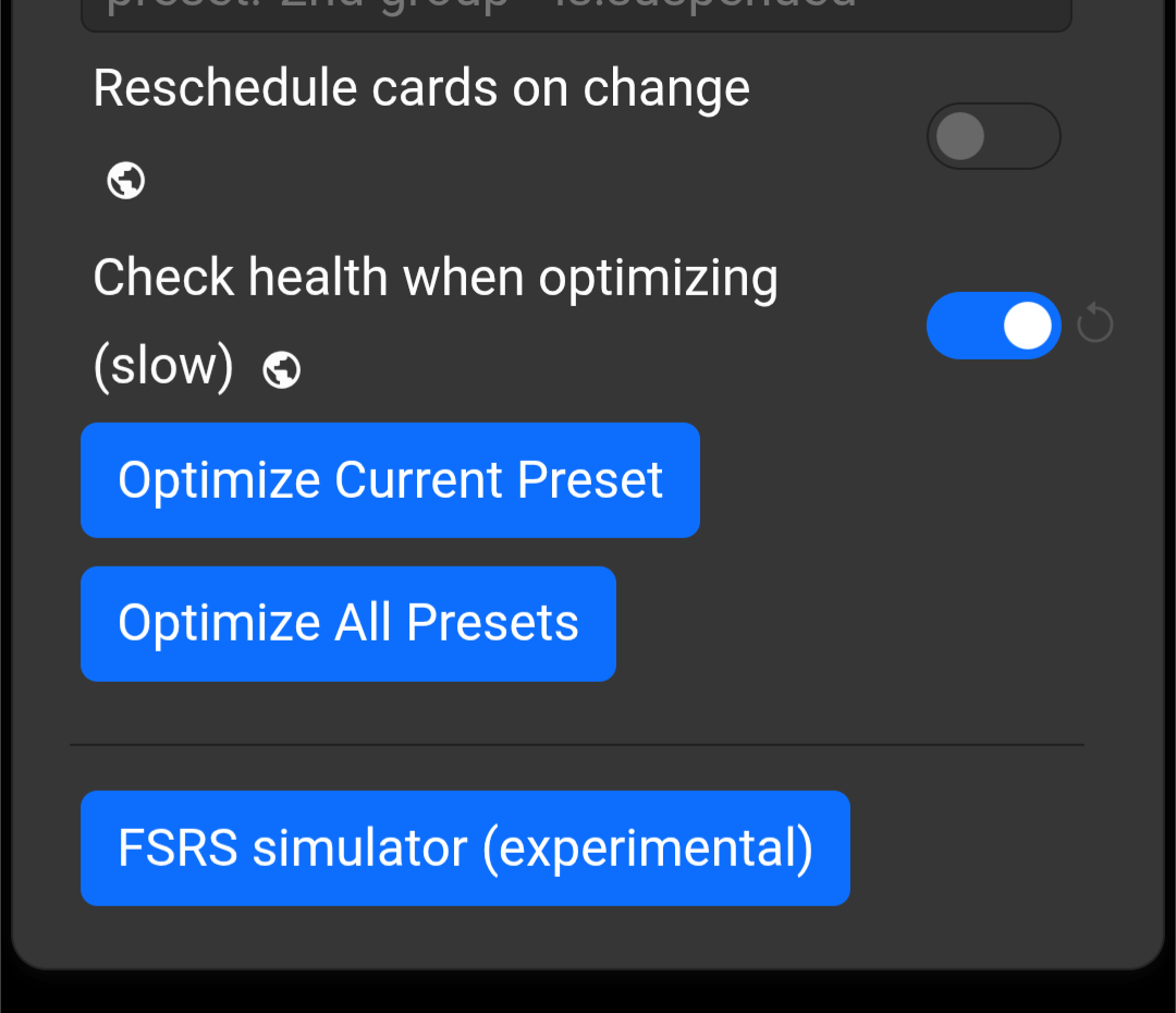
The text of the main button will be longer than what you have in that image – “Optimiz[s]e Current Preset.” And even if you left/right-align the buttons, they will start to look just like side-by-side buttons as the screen/window gets smaller – until eventually there isn’t room to have them on the same line at all.