- Yes (move to same level)
- No (keep the current implementation)
0
voters
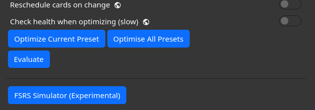
Having 2 buttons with almost the exact same text right next to each other is a recipe for mis-clicks. Especially when the action is happening invisibly and the user would have no idea that they had mis-clicked, I don’t think that’s a good idea.
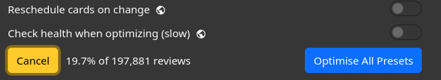
I think that needs considering. here is how it looks with the evaluate option enabled.
Alternatively:
(Edit: Maybe not, it is an obscure option)
I submitted a translation to correct Optimise to Optimise Current Preset. Hopefully that will make this easier to visualise  for all our en-GB folks.
I find myself wondering – and this is probably a question for @Expertium – what is the problem that this is trying to fix? 
Is there an issue with the buttons taking up too much vertical space in Options? That seems like it would only be an issue on small screens, and on the phones I’ve checked, these buttons won’t even fit together on 1 line due to the length of the text.
It’s trying to fix the “current implementation looks ugly” problem
I think there should be a single button Optimize which opens a dialog message with a checkbox Optimize all presets, a Cancel button, and an OK button.
Maybe do another checkbox with “only this preset” next to an “Optimise” button. Thoughts?
Checkbox is a terrible idea. It creates confusion and inconvenience for those who only use “Optimise“ (and not “Optimise All Presets").
“Optimise” (only a single preset) should be the default because it doesn’t produce “side effects“ so to speak.
If you are considering making checkbox behavior, then it should be another way around: “Optimise“ is a standalone button, and “Optimize All Presets“ is a checkbox.
—
I, however, have the same opinion as Danika: nothing should be changed.
You are trying to polish something that doesn’t need polishing.
@Danika_Dakika this should prevent misclicks. Thoughts?
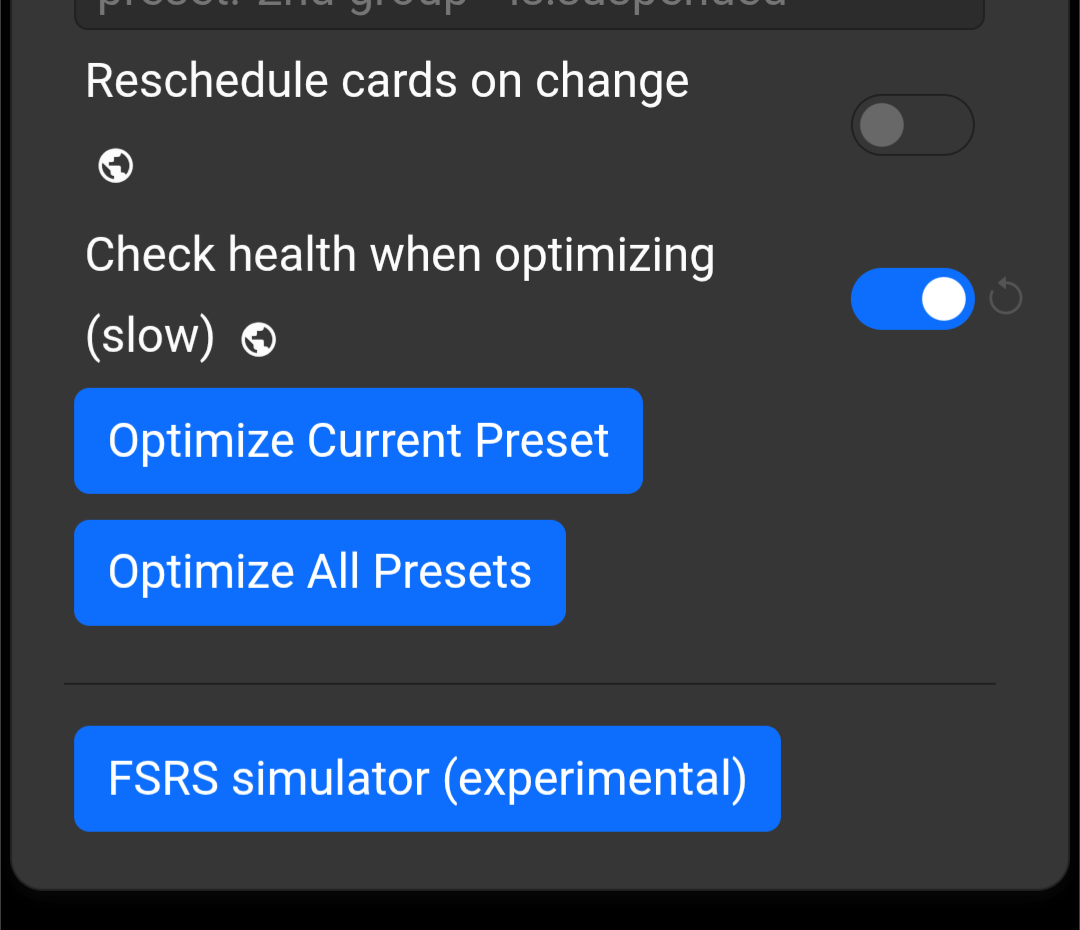
The toggle can be on by default, just like we do for health check.
IMO, it looks really bad. I don’t know, we already have 2 toggles, adding another doesn’t sound that bad to me.
This will look different on mobile devices.
To prevent accidental clicks, you can display a “Are you sure?” window.
Aside from there still being no user-focused reason to make a change at all …
This seems wrong to me from a right-handed-design/right-thumb/mouse-user perspective. When there are right-aligned buttons in a UI, those are usually primary, aren’t they? Even though the other buttons in this section are left-aligned, it still seems like right-aligning this one gives it prominence – lined up so nicely right under those switches.
The text of the main button will be longer than what you have in that image – “Optimiz[s]e Current Preset.” And even if you left/right-align the buttons, they will start to look just like side-by-side buttons as the screen/window gets smaller – until eventually there isn’t room to have them on the same line at all.
What side effects am I unaware of?
Dae said “Nope” to this change
Side effects in the sense that single preset optimization does only what you expect: it optimizes only selected preset.
Optimize All Presets, on the other hand, produces side effects: it optimizes all presets in your collection (not only the preset you selected).
I hope you understand the logic.
Oh ok. I mean, when I click a button that says “Optimize All Presets” and then it optimizes all the presets, I don’t think of that as a side effect. It’s doing what I expect. But now I see what thinking your logic was based on.
It was an argument as to why “Optimize All Presets” should not be the default behavior (because it produces side effects in the form of optimization of the other presets you haven’t selected)
Not trying to argue/change your mind, but I’m curious why you do them individually? Seems like most people, most of the time, would be optimizing all, because the rule of thumb is to optimize each at least once a month. Why not just knock it all out with the click of a single button?