Isn’t it a bit too large? I am not really an expert on UI design but I had to reduce the screen to size 67% for it to look normal again.
I couldn’t tell how large it was from the screenshots alone, but I think the margins are important for readability, otherwise the eyes have to travel a lot of horizontal distance which tires the reader…
Take Obsidian’s website which in my opinion looks friendlier with its comparitively smaller font sizes and better margins. Or Notion’s, which has smaller margins (but not as small as the website’s…) but isn’t a problem in that case because text and important information cards don’t ever occupy that width, only the screenshots of the app do.
Also something I hadn’t realised before I saw the final product is that this doesn’t look like the website of a product I would ever use. I admit that Anki’s design is pretty ugly and/or outdated so screenshots of the software wouldn’t fit into the aesthetic of the minimalist sharpy-right-angled dark-mode-enabled website, but it’s important for me to wrap my head around what using this software looks like. Besides, the websites of most scientific proprietary software looks like that only; modern web design but app screenshots from 1995.
Minor suggestion: in “testimonials” the first quote to be shown should be the one from “Augmenting Long-term Memory”. The one that says, “That is, Anki makes memory a choice”. Of course, without a poll we won’t know which one people find the most convincing (i-want-to-use-anki-after-reading-it kind of convincing), but I think it’s that one.
The other two sound…generic, for lack of a better word. This is the only one that stands out, IMO.
I agree with @Sqrt-1. It feels weirdly large on my desktop screen, and looks a lot more normal at ~60% zoom.
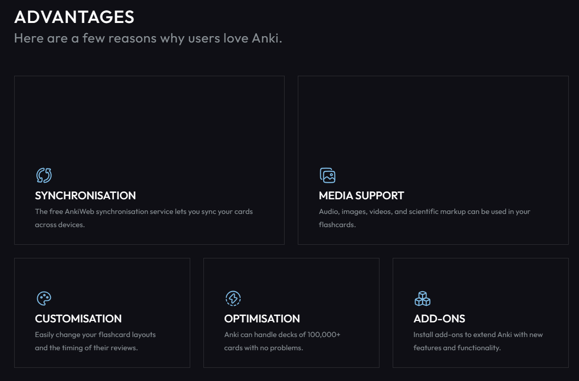
It’s also a little odd that the “Advantages” cards have so much empty space in them (especially the top two). My first thought was “Are there meant to be screenshots / graphics that have not loaded?”.
Then there is even less of a reason for it to lead to the manual. You don’t share decks in the manual.
Honestly, the more I think about it, the more I agree with @SuhasK, it’s very counter-intuitive that it leads to the manual. I can understand “Translate Anki” leading to the manual (though that’s still somewhat counter-intuitive), but not “Share(d) decks”.
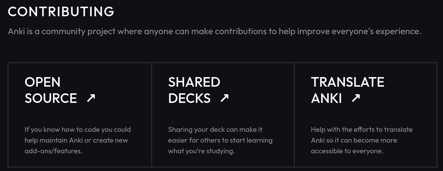
The open source box tells you how to contribute code (as described in CONTRIBUTE.md from github).
The shared decks box tells you how to contribute decks (as described in the manual)
The translate anki box tells you how to help with translations (as described in the translating manual)
All those boxes serve one purpose: They tell you what you can contribute to and where to find more info about that.
I think that is very logical and intuitive, since there’s an obivous structure / hierarchy. It doesn’t make sense to link the shared decks box to the decks download page instead, because that page doesn’t explain how to contribute decks, which is the sole purpose of that contributing box.
Hiding the place where actual users (not contributers) would download shared decks from in a hamburger menu is not intuitive to me though, but that’s somewhat a different topic.
Overall [and none of this needs a response – for all I know it’s been debated and explained above, but I haven’t kept up with the discussion(s).] –
It’s too dark. Even as someone who uses night mode almost exclusively (in one form or another), the darkness is overwhelming.
I suppose all that darkness is meant to look modern? To me, it ends up looking a bit dull.
Aside from design – is all of this text settled on? I think there’s a lot that could be improved, but my top 3 –
“The flashcard application that makes sure you only practice the things you’re about to forget.” – I am not thrilled with that wording for such a prominent tagline. It’s both too casual and too controlling.
In Anki and the docs, we use the “z” version of words like synchronization, customization, optimization.
I know “keldin, via Email” came from the old site, but who is that? I agree with Expertium that the Nielsen quote should be first.
It seems like this site says less about Anki in 5-screen-fuls of space (when viewed at 100%) than the current site says in 2-screen-fuls. That’s a lot of scrolling for not much payoff. I can’t see folks doing much but clicking the Downloads link to jump to the bottom.
+1 here too. It’s way over-sized on my screen (and my screen isn’t that big). I appreciate that it grows with window size, but there should be an upper bound.
Also related to font size – I don’t understand the use of huge empty blocks of space. By the time I get the overall site down to a reasonable display size, the tiny text here is almost unreadable. It would be one thing if these boxes lit up, or linked to something, but they don’t do anything. I agree with rossgb that it gives the impression something is broken or hasn’t arrived yet.
+1 to this. In context, all of those make sense as links about how to contribute that way.
Yes, that makes more sense as a title in the “Contributing” section.
The rationale for this in the past has always been – you can’t do anything with the decks until you have the app installed. You can’t import in AnkiWeb, and each of the apps has their own path to the Shared Decks – so there’s no need to make the Shared Decks site more prominent. [Although I admit being confused about why the existence of shared importable decks is not even mentioned as a feature.]
This is a list of what I have curated. Items in italics are debatable from my view.
Too large font sizes (ongoing PR)
Small side margins (ongoing PR)
The screenshots are different from the real Anki app
Reorder testimonials (ongoing PR)
Too dark
“Advantages” cards have too much empty space (ongoing PR)
shared vs. share decks (ongoing PR)
Cards should be interactive
American vs. British spelling (s vs z) (ongoing PR)
“The flashcard application that makes sure you only practice the things you’re about to forget.” is too casual and too controlling
Explanation (My Opinions)
The screenshots are different from the real Anki app
The one on new website is redrawn in SVG and I think it is better than a bitmap image. The differences are the styling, i.e. font, color, and spacing, but placement and functionality are exactly the same. I suggest we edit the current image to resemble the real one more closely.
Too dark
Yes, it is darker than most websites but it really down to personal preference. It is not complete black and lighter than YouTube dark mode. We might need a poll for this.
Cards should be interactive
If the cards are interactive, e.g. light up, they should link to something (personally it should be this way). If they are not linking to anything, I think the current state is reasonable.
I understand your explanation and I think it’s a good one. And I am not aware of how this would be but, could it be possible to show more parts of the Anki app in various sections? Like, the Browse window and the Add new card window are pretty important but missing.
I also believe some screenshots of AnkiDroid and Anki Mobile are important as well, and they might be better for the website because their UI is much better than desktop Anki.
Not necessarily; obsidian.md for example has this cool hover feature which is completely useless, and probably several other examples. And if they must link to something, you can link them to sections of the Anki manual.
I personally find the page a bit dark too, and would welcome some lightening of it if consensus agreed.
On the whole though, I think it’s an improvement. The old page was starting to feel dated in appearance, and this new implementation makes it easier to update, and easier for other users to tweak.
The landing page is now in the Ankitects repo and it’s possible for anyone to create pull requests with their changes as they see fit. I’m not going to have time over the next few weeks to make any significant contributions, though I might chip in where possible.
If you feel strongly about anything in particular I suggest you create an issue in the repo where we can track and discuss particular changes in more detail.
This is my take on the screenshots. I tried to combine both the Anki app and the design as much as possible. The deck image may look shifted to the left but it is actually correctly aligned with the Anki app.
4 people and 27 likes across all of them isn’t a whole lot, but still
Btw, @landingpageguage do you mind if I make a poll on on r/Anki asking people which one they prefer?