Found a bug in 2.1.56 (on macOS qt6 fwiw).
In the forecast graph, it should show the currently confirmed cards in the graph and also show the total possible amount including ones being (re)studied when hovering, but in 2.1.56 it shows the latter and when hovering the amounts are the same. (Adding screenshots of .55 vs .56)


Is it possible that the preview mode remembers the previous window state, thus remaining for example maximized ?
Same for deck options and Anki preferences

Since updating to Anki 2.1.55+ I’ve had this feeling that something felt off about the reviewing screen, and I realized it after comparing with 2.1.54.
In 2.1.54 there is a dark line dividing the top bar with the card, whereas in 2.1.55+ there is no line divider. I think it looks much better with the dark line divider as in 2.1.54, functioning as a clear divider between the top bar and the card.
Also considering that the bottom bar has a line divider between it and the card, it would be more consistent if it was also on the top, as it was in 2.1.54 and before.

2 Likes
When adding tags, the menu for existing tags is too far away from the text box when there are less than ~7 tags shown.
Here’s a screenshot with >7 tags shown:

Here’s a screenshot with <7 tags shown:

EDIT: As an aside, it would be convenient if, once there is only one tag left in the list, the final tag was automatically selected so that hitting ENTER would add it to the note.
1 Like
I agree. A dividing line improves the appearance.
A similar comment applies to the Decks screen. It looks odd to have the top and bottom of the decks list cut off. The easiest fix would be to add lines between the “Decks/Add/Brows/Stats/Sync” header and the deck list and between the deck list and the “Get Shared/Create Deck/Import File” footer".

Alternatively, what if the width of the “Decks/Add/Brows/Stats/Sync” buttons were increased so that they were slightly wider than the deck list, and the gap below them was removed? Here’s a quick demo to illustrate what I mean:

I also recommend removing the rounded corners from the top-left and top-right corners.
![]()
For the footer, an alternative to a line would be to make the footer a different color visually differentiate it from the deck list:

A few more minor comments on the “Decks/Add/Brows/Stats/Sync” header: If you click and hold “Browse” while moving the cursor to hover over “Stats”, you see a gap between the two buttons. As a result, a section between each button is not clickable.

I would also modify that “hovered” and “clicked” appearances of the buttons for two reasons:
- The current “hovered” appearance makes the button look indented, due to the shadows at the top and sides, making the button appear slightly pressed. What if we change this to darkening the entire button?
- The difference in appearance between when a button is “hovered” vs. when it is “clicked” is hardly noticeable. Maybe we could turn the button blue while it is clicked? Similar to this:

It does look odd on your screenshot. However, if you don’t have that many decks, the new appearance looks very clean:

If you were to add lines under the header and above the footer, like you suggested, then that would not look as nice on my screen… So I feel like a different solution would be needed, so that it looks nice for people with a long deck list as well as for people with a short list.
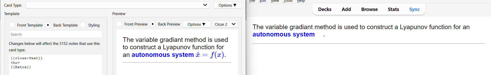
Parts of MathJax equations are not rendering correctly. Here, the parentheses around “x” are missing
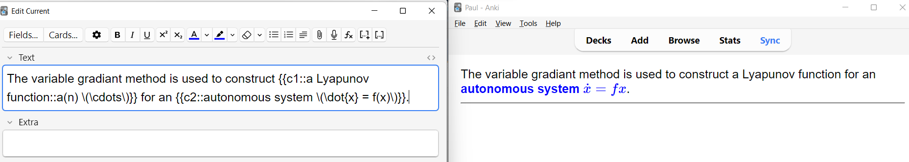
Even worse, when I move to the next card, press “undo”, then study the card again, this time the MathJax equation does not appear.

I thought this might be related to the JavaScript I was using to define LaTeX macros, but the problem persists after I remove the script from my template. Note that the equation is rendered correctly in the Card Type window.
I have disabled all of my add-ons to make sure that they aren’t causing the problem.
Edit: This might have actually been related to the script I was using. It called MathJax.startup.getComponents(); several times. Changing the code to
if (typeof is_already_run == 'undefined') {
    is_already_run = true
    MathJax.startup.getComponents();
}
and reopening the card study window appears to fix the problem. I’ll create a new post if I see related problems again.
Thank you always for the great work, developers. 2.1.56 is wonderful.
The text of the save button in deck options seem vertical in some languages (the languages which use double-byte character?).
Japanese

Traditional Chinese

Korean

English

France

2.1.57 will ship changes to the toolbar. Users can choose if they want it to behave like a dock (hide after 1s) or blend in with the background with a transparency effect.
Another change that might make it into the next release is a minimalist setting in the preferences. It essentially brings the 2.1.49 look back to the webviews.
3 Likes
9 posts were merged into an existing topic: Brainstorming for modern UI [Anki 3.0]


Yes, that’s normal. The toolbar adjusts to the background and has a less obtrusive look in the reviewer.
3 Likes
This topic was automatically closed 30 days after the last reply. New replies are no longer allowed.