Yes, probably you’re right and it just a matter of getting used to it. However, the fact that not all the options are visible on this view, and that the disposition of the elements on that screen is rigid instead of responsive (“Timer” always appear to the right of “Daily limits” and the lower options are cutted off, breaking the logical disposition of the elements) is what I find a little bit confusing.
Of course, not a real problem, since by just resizing the window I can easily get the original one column screen I’m used to, just my opinion.
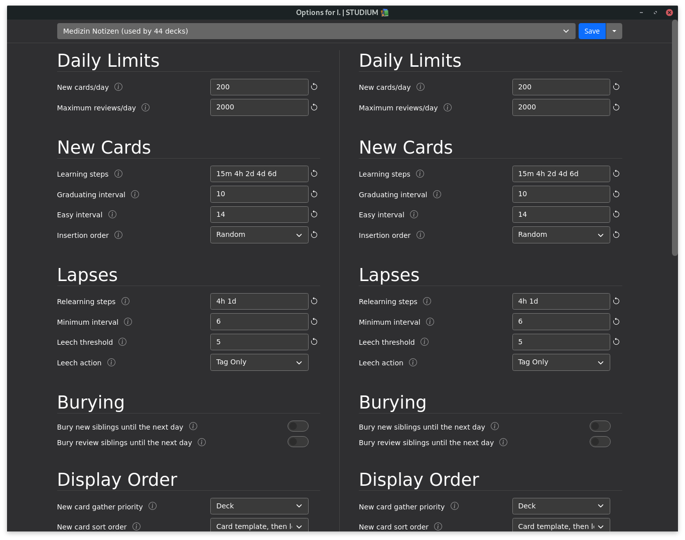
The content is actually distributed evenly between the columns. Since I don’t know of any add-ons that use the new deck options api yet, I just added another NewOptions item to show you how it responds:
Not sure if this is the place to post bugs but in browser, when “Toggle showing notes” is on, the colors indicating flags, suspends, marked, etc. is gone so all cards look the same — white. The colors only appear in “showing cards”. Also, when toggling between cards and notes the columns chosen to be shown changes (i.e. if I choose for ‘Tags’ column to be shown in “showing cards”, toggling “showing notes” will not apply this change, and vice versa).
The point is that you’re then seeing notes, not cards. Only cards can be suspended or flagged, but the colour for marked should show in both modes. That’s because every card has exactly one note (so we can say a card is marked, when its note is marked), but one note can have several cards (which can have different flags, for example).
That as well is a feature, not a bug. Some columns are more useful for cards and some for notes, so Anki lets you keep a different set of active columns for every mode.
Hmm I see. I guess it’s just different from what I’m used to with the Add-on List one card per note, which is now broken. I liked seeing only the note (to save space) but also seeing which notes are suspended and flagged. Is it possible to meet halfway and make it so if all the cards of that note are suspended/flagged, then the color will show up? This is especially useful for ppl who suspend everything in a deck and unsuspend entire note when needed.
I actually like that the suspend color doesn’t show in note view. It’s an easy way to spare my eyes from that obnoxious yellow wall ^^
Actions like “Suspend all Cards” with color indication in note view could be handy for power users, but they would blur the clear cut between note- and card view, so the educational effect for new users might get a bit diminished.
I agree with @kleinerpirat that the row colours are not what one would call aesthetically pleasing. However, I appreciate that many users rely on them, so it might be worth considering to indicate notes with all cards suspended. I can’t really see that being useful for flags, though.
Let’s see if other people want to chime in.
Suspending all cards of the selected notes is already possible, by the way, since in notes modes, the selected notes’ cards are considered selected for card actions.
If I may, I suggest implementing symbols that appear at the end of the ‘Sort field’ similar to MacOS’ tagging system. You could even make it a separate column so you can remove it if you don’t need it.
Yes but how would you know in notes mode that the selected note is suspended or not? You’d have to switch to cards mode to see the color. That is not a very efficient way and can be a pain very quickly imo.
That was an answer to what @kleinerpirat had written. Anyway, I get the sentiment, but since strictly speaking notes can’t be suspended, you can argue both ways.
I think this would be better GUI-wise and it has been suggested before. But I’m not sure how well it would work in Qt.
Sorry, I forgot that I’m using 130% as user interface size, at 100% all options are visible in a single screen (100%, however is not a choice for me, the GUI is really small at a resolution of 1920 x 1080)
Some characters (like { and CJK ideographs) now get converted to percent-encoding when used within HTML attributes.
It’s inconvenient for a number of reasons (not manually searchable, small but needless size increase esp. as I’ve got 10k’s characters affected, obfuscates & bloats the strings when editing, …)
Not sure if this is deliberate or an unintended by-effect (of the new inline HTML editor?).
That could be a nice way to solve it in a future update.
@nwwt this should just be the way the HTML editor is showing the text, not what is actually being saved in your collection
@hengiesel it’s caused by escape_media_filenames(). The code dates back to the WebKit days, and I suspect it’s no longer required - will try stripping it out.
The html view (Ctrl+Shift+X) is much better, but after I activate it and restart anki (or the browser window), the field forgets to be show as html code only. Can it remember to show html code until I switch it back with Ctrl+Shift+X?

