I’ve just noticed that copying from a field whose background is red to show that a duplicate exists preserves the css code for the red background

I’ve just noticed that copying from a field whose background is red to show that a duplicate exists preserves the css code for the red background
Testing on MacOS:
(with no addons since I don’t use any now that the rescheduler options are built in)
(default color mode ie not night mode)
There doesn’t seem to be keyboard shortcuts for the new list options in the editor (ie bullet, numbered, indent,outdent and alignments). They may be there, but I don’t see them via tool tips like the rest of the buttons.
On the main deck screen, I see Deck, New, and Due. I don’t see a label for the learning yet there is a number there.
I generally think the deck options are a step in the right direction but the text box alignment seems odd visually. Layout wise I like the groupings and progression of the settings.
Browse screen seems significantly faster rendering notes.
As always, thanks for a great app.
About Stats Plus and Review Heatmap on alpha version
if they are enabled together → Review Heatmap get bugged
1.not appearing (new issue on alpha version)

2.“clicking in the graphs isn’t working” (already know issue)
Anki 2.1.45 (10bfb95f) Python 3.8.6 Qt 5.14.2 PyQt 5.14.2
Platform: Windows 10
Flags: frz=True ao=True sv=2
Add-ons, last update check: 2021-05-18 09:49:01
Caught exception:
Traceback (most recent call last):
File “aqt\webview.py”, line 41, in cmd
File “aqt\webview.py”, line 139, in _onCmd
File “aqt\webview.py”, line 593, in _onBridgeCmd
File “decorator.py”, line 232, in fun
File “anki\hooks.py”, line 89, in decorator_wrapper
File “anki\hooks.py”, line 86, in repl
File “C:\Users\Vidal\AppData\Roaming\Anki2\addons21\review_heatmap\links.py”, line 69, in heatmapLinkHandler
return None if not _old else _old(self, url)
File “C:\Users\Vidal\AppData\Roaming\Anki2\addons21\877182321\column.py”, line 13, in _linkHandler
(cmd, arg) = url.split(":")
ValueError: too many values to unpack (expected 2)
disabling Stats Plus would fix Review Heatmap
before, on the 2.1.41+ addons packages (anking), was normal (only the second problem had occured) so just a heads up, wasn’t sure if i had to post this on the Review Heatmap or Stats Plus gifthub
Sorry if I’m missing something too obvious, but where can I find these options?
Sorting
Additional deck options have been added to control the order new cards and reviews are presented in. New cards can be mixed from multiple decks, and reviews can be ordered by interval.
When burying is disabled, it is now possible to control whether siblings are shown together or not.
The options controlling the mixing of new cards and interday learning cards have been moved from the Preferences screen into the deck options. The options will be used from the deck you select to study.
I can’t find them on the new deck options screen, and at least, the option controlling mixing of new cards seems to be still on the preferences screen:
Then, probably there’s a reason but I’m finding a little bit confusing that there are two different keyboard shortcuts for the Undo command, the standard CTRL + Z on the deck window:
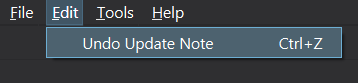
And CTRL + Alt + Z on the browser window:

Also, I’m finding some problems with the new Undo feature when update notes, it seems to work OK with some notes but not with others. I’ll keep experimenting and try to report something more specific.
And finally, the new undo feature is very powerful, but without a redo function could also be a dangerous weapon for the end user in some circunstances IMO.
To try the v3 scheduler, it seems you have to enable it using the debug console. See the Trying it out section.
Thoughts on the new update:
Add-ons with errors:
Browser Resizer (needs updating to hook):
browser_resizer.py", line 40, in
Browser.updateFont = wrap(Browser.updateFont, updateFont_wrapper, “after”)
AttributeError: type object ‘Browser’ has no attribute ‘updateFont’
Special Fields (resolved with alpha2):
note_type_mapping.py", line 4, in
from anki.models import NoteType
ImportError: cannot import name ‘NoteType’ from ‘anki.models’ (/Applications/Anki.app/Contents/MacOS/anki/models.pyc)
Collapsible Fields (error resolved with alpha2 but add-on doesn’t work):
field_dialog.py", line 8, in
from anki.models import NoteType
ImportError: cannot import name ‘NoteType’ from ‘anki.models’ (/Applications/Anki.app/Contents/MacOS/anki/models.pyc)
Anki OCR (needs updating):
from aqt.browser import Browser, QMenu
ImportError: cannot import name ‘QMenu’ from ‘aqt.browser’ (/Applications/Anki.app/Contents/MacOS/aqt/browser/init.pyc)
Ze Add Note ID (error resolved with alpha2, untested):
field_dialog.py", line 8, in
from anki.models import NoteType
ImportError: cannot import name ‘NoteType’ from ‘anki.models’ (/Applications/Anki.app/Contents/MacOS/anki/models.pyc)
Clickable Tags (resolved with alpha2):
from aqt.browser import PreviewDialog
ImportError: cannot import name ‘PreviewDialog’ from ‘aqt.browser’ (/Applications/Anki.app/Contents/MacOS/aqt/browser/init.pyc)
Advanced Browser (needs updating):
addons21/874215009/advancedbrowser/core.py", line 265, in setupColumns
super(AdvancedBrowser, self).setupColumns()
AttributeError: ‘super’ object has no attribute ‘setupColumns’
Review Heatmap: just doesn’t work. @glutanimate maybe you know about this? UPDATE: @hengiesel it appears this add-on works if Stats Plus is toggled off (but on my other profile it works with both… not sure where the hiccup is)
Also getting this error when clicking a deck:
review_heatmap/activity.py", line 277, in _revlogLimit
dids = self.col.decks.active()
File “anki/decks.py”, line 480, in active
AttributeError: ‘Scheduler’ object has no attribute ‘active_decks’
Straight Reward: doesn’t work with the new options layout (needs updating for compatibility with old layout, but is still functional)
Amboss add-on: error when reviewing cards (needs updating - reported)
The new options screen contains a number of built-in warnings for when the user changes settings that don’t make sense in the context of their other settings. For example, if you set the final learning step to be larger than the graduating interval, a warning will be shown that the graduating interval needs to be increased. With a tab-based layout, all related options would need to be on a single tab, or the warnings would need to be shown in both places, and it would be harder to see the related options at once.
Moving away from a tab layout also allows more flexibility in grouping - we can have a separate group for Audio for example, whereas a separate tab with only one or two options would be awkward.
How much of your objection is based on the move away from tabs, and how much of it is the fact that the text/widget styling needs some more polish to make it blend in better with the existing Qt screens?
Re add-ons, these have been fixed on Anki’s end:
This may be; I’ll look into it:
These will need fixing on the add-on end:
It looks like the new undo code is accidentally forcing a full sync each time something is undone - please hold off on using it until alpha 2 is ready.
Ok, alpha 2 is now available.
Multiple changes within a minute should be being rolled into a single undo step - would that explain things?
“Learning” takes up a fair bit of space - leaving it out allows more room for the deck names. The alternative would be to roll it into the Due column, but when I briefly tried that I ran into issues with alignment (which are probably fixable by a motivated person).
I can’t seem to reproduce this - which OS?
Thanks very much to everyone involved for the quick update, closet and toggle cards / notes are working beautifully now, and the new redo command is a great addition.
Thanks for clarifying, yes, that could explain the problem, I will keep testing in any case.
Just found this minor cosmetic issue on the new Deck option window:
Windows 10.
I’ll attach a couple more pictures to show what happens.


The new options screen contains a number of built-in warnings for when the user changes settings that don’t make sense in the context of their other settings. For example, if you set the final learning step to be larger than the graduating interval, a warning will be shown that the graduating interval needs to be increased. With a tab-based layout, all related options would need to be on a single tab, or the warnings would need to be shown in both places, and it would be harder to see the related options at once.
Moving away from a tab layout also allows more flexibility in grouping - we can have a separate group for Audio for example, whereas a separate tab with only one or two options would be awkward.
@dae these reasons make sense. Unfortunately I think the tabs are more user friendly because it helps separate out “what’s going to happen to new cards” or “what’s going to happen to review cards.” In this case, perhaps a visual overhaul is needed to keep the benefits you discuss but also make things more organized. I think making it look like the old QT options would be very helpful and blend better. I would suggest putting the number input boxes closer to the actual text. I would make the dropdown boxes look like the old QT (right now you can’t tell they’re drop downs till you actually click on them). I would use horizontal lines or some sort of divider along with the headings so major categories are more clear.
Hopefully these are helpful suggestions. I also have 20k anki users on instagram that I could easily poll if that would be helpful
I can’t see cards in browse. I choose any tag, category, deck, anything and it just doesn’t open. I uninstalled all addons, but it didn’t help. When I tried to downgrade & quit got this message:
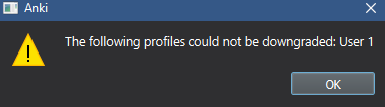
And even when i don’t want to downgrade i get this message:

You have to downgrade using the most recent Anki version you have opened the profile with.
Since you are posting here, I assume you have opened the profile with Anki 2.1.45. Before you can use an earlier version, you have to open Anki 2.1.45 again and choose “Downgrade”.
As for why the sidebar wasn’t working, my guess is you have switched to the second button at the top of the sidebar, which turns it into multiple selection mode.
@Rumo perhaps we should make this revert to search mode each time the window is opened, instead of remembering the last mode?
Would be fine by me. But it would probably dissatisfy other users.
@Rumo I really enjoy using the card-note-switch! Just a little feedback on the aesthetics:

The switch is positioned a bit lower (has a lower bottom margin) than the sidebar buttons. A better vertical alignment would look a bit more professional imo.
I like that the light blue color makes the switch very easy to find, although it looks a little bit out of place to me, because most UI-elements share a minimal black & white theme.
Different colors for card- and note-view could make for a good visual indicator for which mode you’re in. That would justify the use of the bold colored look a bit more.
Using Color Wheel - Color Calculator | Sessions College with the harmony option “analogous”, I found this green which might be a good fit, since it’s also quite neutral and not as prone to interpretation like red, yellow or orange, but still different enough to notice.
Cards: ![]()
#77ccff (same as before)
Notes: ![]()
#77ffab
0 voters
After some use, I’m loving the new deck options window, I find it logical and intuitive, and the on screen extra info is a great help.
With all that info in a single screen, what I’m missing, perhaps is some on-screen indication about which options / parameters affect the parent deck AND its subdecks (red in the screenshot below) , and which ones affects ONLY the parent / actual deck (yellow in the screenshot below). Maybe I’m missing something, but both types of parameters seems to be mixed in the same window, which, in my opinion can be confusing for some users:
Some kind of visual clue or indication about this aspect would be, IMO, great.
Also, some kind of colour code would maybe help to improve the window ease of use, specially for less experienced users:
I’ve been playing with the stickie field option. I never used the addon that does the same.
I’m sure for many folks the stickie approach makes a lot of sense.
What about an option for defaults in the fields? Set in the fields options maybe. Let’s say I have boilerplate for each field, using stickies I have to delete content each time. With defaults I would fill out the new content.
Just a thought…
It looks like an add-on is messing with the GUI in your screenshot. You can see below how it’s supposed to look.
I’m not sure if it’s desirable to have the same margins on both sides as the widgets differ in height. And of course, the searchbars weren’t vertically aligned before, either.
I agree that the colour schema could be improved, especially in day mode. I was restricting myself to the existing Anki palette and white on the “highlight” colour was the best I could come up with. If you (or someone else) have an eye for colours and want to extend it, I would gladly incorporate the new colours.
The suggested green is a bit low in contrast:

The background colour for cards with a green flag works well:

But the day-mode counterpart less so in my opinion:

For anyone interested: New colours are added in ts/sass/_vars.scss and the colour of the switch is set in qt/aqt/switch.py#96.


