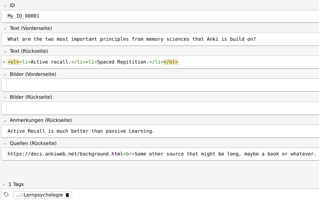
How can I make list elements (`<li>`) more readable, while still being subtle?

Problem

I am redesigning my card templates. They should follow the following rules:

  1. Must work on any display size (Desktop and Smartphone).
  2. Must work with dark and light mode (e.g. using .nightMode)
  3. The main info must be the focus, other elements mustn’t distract from it.
  4. The design should allow skimming of all important info without much cognitive load.

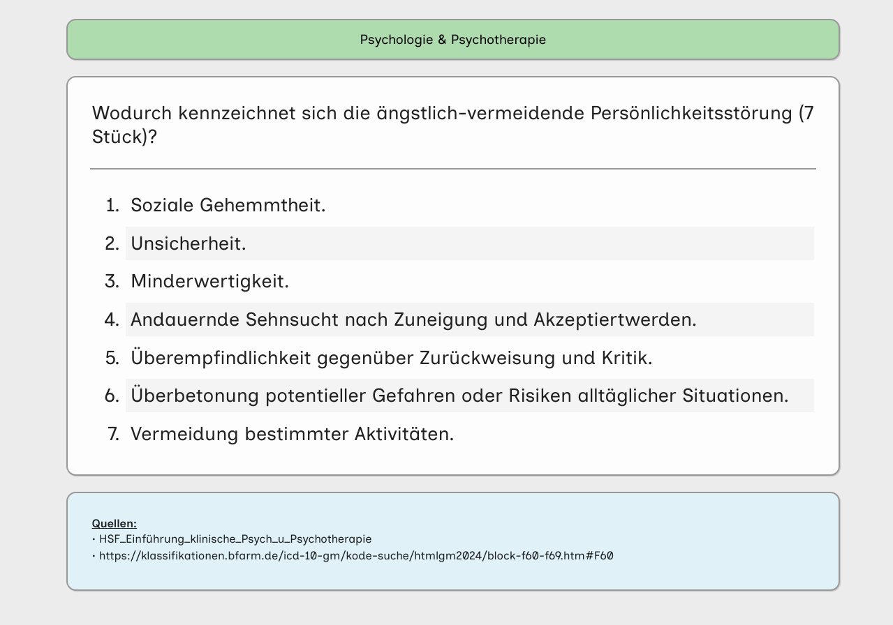
I don’t really know much about design but I think I achieved a very reasonable result. I do wish to improve readability subtly for my list elements though. Here’s what I mean – In the following picture, the list elements are a bit “overloaded”, especially on small screens:

I’d prefer there to be some sort of visual distinction, making it easier to find the different li elements. Granted, on this card it isn’t that bad. But other cards do have longer text, because the symptoms cannot be reasonably shortened.

Proposed solutions

#1

At first I thought all I needed to do was increase the spacing between list elements. That is easy to do with the following code

li:not(:last-child) {
	margin-bottom: 10px;
}

Result:

While this works, I’m not really happy with it. I cannot really put my finger on the issue that I’m having though. So, I tried another option.

#2

I figured I could also add colors to the li elements. All I’d have to do is make is visible, while still beeing subtle.
It could be achieved by something like this:

li:nth-child(even) {
	background-color: rgba(240, 240, 230, 1);
	border-radius: 0.125rem;
}
li:nth-child(odd) {
	background-color: rgba(230, 240, 240, 1);
	border-radius: 0.125rem;
}

But I cannot get it to look subtle, visible and somewhat stylish. Result:

This background version looks especially bad on wider screens:

And if only a few li elements are present:

Maybe more subtle colors would help but I could not find good and fitting colors.

Question

So, does someone have ideas to make the list elements a tad more readable, while still being subtle and somewhat stylish? I’m especially looking for visual help as I’ll probably be able to code the design myself once I find something I’d like. But, of course, every kind of help and ideas are greatly appreciated!

Thank you in advance!


Regarding my third 'rule'

As an example, I have an extra field which shows conditionally (only if there’s text) and which I use to show examples and additional info:

The color here, as well as in the sources box (blue box “Quellen” at the bottom) are subtle enough for me. I don’t get distracted by them and look into the white block instead (where question and answer show).

2 Likes

I’d share one specific case from my practice of making lists more readable.

It’s relevant to language learning only. Not a universal approach.

My English language cards usually have lists of examples retrieved from online dictionaries for given word. The same approach works for other languages.

There is “Cross-Field Highlighter” addon making exact words in list visible:

Highlighted words are marked with CSS style cross-field-highlighter, so you can adjust it in the card template. As HTML code is modified, it works on all devices you sync your collection.

This approach is very convenient for long lists:

Thanks. I don’t learn languages so this doesn’t help that much unfortunately. Though the highlighting idea is quite similar to my idea #2 I proposed above (if the highlighting were by row).

Maybe I could work with a very faint background (“highlighting”) of the rows and combine a spacing like so:


It’s very faint and almost invisible, though it does help me somewhat. Still not conviced this is the best solution. And it has a big caveat: Due to its faintness, it’s basically invisible on some screens / monitors.

Here’s the code:

li:not(:last-child) {
	margin-bottom: 0.25rem;
}

li:nth-child(even) {
	background-color: rgba(240, 240, 230, 0.2);
	border: 2px solid rgba(240, 240, 230, 0.6);
	border-radius: 0.125rem;
}

li:nth-child(odd) {
	background-color: rgba(230, 240, 240, 0.2);
	border: 2px solid rgba(230, 240, 240, 0.6);
	border-radius: 0.125rem;
}

Just dropping a few more ideas.

#1

Pictures and Code

This uses another approach. Colors are much less subtle but are complementary and really do help in visually separating <li> elements.


li:not(:last-child) {
	margin-bottom: 0.25rem;
}

li:nth-child(even) {
	background-color: rgba(173, 216, 230, 0.3);
	border-radius: 0.5rem;
	padding: 0.25rem;
	border: 1px solid rgba(0, 0, 0, 0.25);
	box-shadow: 1px 1px 0px rgba(0, 0, 0, 0.15);
}

li:nth-child(odd) {
	background-color: rgba(230, 186, 172, 0.3);
	border-radius: 0.5rem;
	padding: 0.25rem;
	border: 1px solid rgba(0, 0, 0, 0.25);
	box-shadow: 1px 1px 0px rgba(0, 0, 0, 0.15);
}

I dislike that the · or the numbers aren’t part of the box though.

#2

Pictures and Code

Basically like #1, but with the · / the numbers being inside the same “box”.

ul, ol {
	padding-inline-start: 0; /* Neccessary because `list-style-position: inside;` only shifts the marker, and this property is set to 40px by default*/
}

li {
	list-style-position: inside;
}

li:not(:last-child) {
	margin-bottom: 0.25rem;
}

li:not(:last-child) {
	margin-bottom: 0.25rem;
}

li:nth-child(even) {
	background-color: rgba(173, 216, 230, 0.3);
	border-radius: 0.5rem;
	padding: 0.25rem;
	border: 1px solid rgba(0, 0, 0, 0.25);
	box-shadow: 1px 1px 0px rgba(0, 0, 0, 0.15);
}

li:nth-child(odd) {
	background-color: rgba(230, 186, 172, 0.3);
	border-radius: 0.5rem;
	padding: 0.25rem;
	border: 1px solid rgba(0, 0, 0, 0.25);
	box-shadow: 1px 1px 0px rgba(0, 0, 0, 0.15);
}

The text now being directly underneath the decimal ::marker really isn’t ideal, though.


I’m still experimenting though. If I had to use the above, I’d probably change the colors though, maybe to something like this:

3 Likes

Hi there :slight_smile:

First of all, i want to complement you on your card designs. Especially the later ones look quite neat in my opinion :smiley:

One idea for a general improvement for the readability of the text might be to try out different fonts. There are several fonts out there, which aim to make the characters more distinguishable (e.g. Atkinson Hyperledgible, Inclusive Sans, or Lexend). Even if you don’t have bad eysight, the might make it more easy to read the text. In my opinion, they to make text actually less subtle in a way, so it might not be what you are looking for.

There are also some fonts out there which claim to increase the speed of reading, although i don’t know if that is based on empirical data. But you could try it out.

You might also want to experiment with font-kerning, letter-spacing and line-height for general improvements in readability.

Furthermore, i do think that you might want to consider broadening your approach for adressing the issue. Changing the appearance and layout of the text will lead to some improvements, but i think you could achieve more by modifying the actual content. For this you might want to consider some or all of the following suggestions:

  • try to eliminate as much unnecessary words as possible
  • consider supstituting words with single characters, e.g. “und” = “+” , “oder” = “/” etc.
  • highlight the most important words with e.g. <em>, <b>, <u> etc. Consider hightlighting nouns and adjectives differently to not ‘overread’ anything.

If you want to keep the unmodified text arround for reference, you could keep it in a separate field, hide it by default via e.g. visibility: hidden; and only show it when checking a <input type="radio"> element or tapping a button.

Finally, you might want to consider using the build in {{cloze}} note type for learning content of lists. It will make it easier to remember each point of the list, because you reduce the amount of information. In addition, grading your answer is much more accurate. When you repeat a non-cloze card with a list, and you don’t remember 2 of the total 6 points, you have two options:

  • grade your anser as “well” and risk not remembering the 2 points the next time, or
  • grade your answer as “bad” or “again” and repeat the 4 points you did remember more than you would need.

When learning lists via {{cloze}} cards, these issues is alleviated. You can also selectively group some list item if you absolutely want to learn them together.

When using the {{cloze}} note type you might choose to hide the inactive clozes via the class .cloze-inactive and / or highlight the active clozes via the class .cloze, which are both added by Anki to the HTML.

Hope some of this helps :slight_smile:

Cheers!

4 Likes

That’s interesting. I never really considered different fonts. While it won’t help with my <li> elements, I’ll definitely try this out, as it might improve my cards overall. I also have separate css rules for <code> blocks, which might benefit from another font as well.

I couldn’t find such a font at the moment, but I found this: https://dl.acm.org/doi/fullHtml/10.1145/3502222. In short: Fonts can improve reading speed (while comprehension stays the same), but it does depend on the individual – there is no “one font fits them all”.

I left my font-kerning on auto I’m pretty sure. I tried letter-spacing but it felt subjectively worse compared to the default font spacing. I do have line-height set to 1.25 for all elements in my card though, which did really help when I did that (the screenshots already have that set).

I do that to an extend, but decided to be more verbose in some situations. Also: The screenshot I provided above shows symptoms, which cannot reasonably be shortend.

I do have a few cards which could be updated though – this one isn’t one of them, but still has the issue with the <li> elements. German words are quite long and the display on smartphones comparitively small. That’s the motivation for a better distinction between <li> elements (e.g. the reason why I increased the margin between them).

I did use cloze notes for (I think) half a year. They proved to be worse for me, which is why I converted all of my cloze cards to basic cards.

My rule here is easy: I didn’t remember a single thing or did it wrong? → Again.

Of course, I might be over learning a few things, but as a psychologist I’m expected to know these things from heart anyways. It works quite well for me this way, though that’s largely attributed to the way I create my cards. It it weren’t for long symptom cards (or similar), then the cards would be very, very short.

Also: I often remember longer things like symptoms or stuff like developmental changes in different age groups via small “stories”. If I do not use cloze cards, then I’m forced to use my “stories” as a means to remember, which improves retention for me drastically.

The issue with cloze cards is that I’m too good at remembering patterns. I often didn’t have to read the card, as the pattern of the text I could see and the occluded text triggered the memory – which unfortunately wasn’t available once I needed it outside of anki though. For the same reason, I try to not do the other suggestion you had:

Altough there’s one distinction: If it’s a terminal program or code, then it does get special treatment:


In summary: I’ll have a look at different fonts. I’ll also still be looking for ways to get a better distinction between <li> elements. Thanks for your advice!

Ok yeah, i get your points. Sometimes the learning material really cannot be condensed any more withouth loosing to much information or relevant context. If mnemonics work great for in those cases, then than thats a good approach.

One more thought i had about highlighting the different list items would be to try out a unique color for every list item. On the other hand, this might make it less subtle and more distracting. And until sibling-index() is implemented in browser engines, you would probably have to use javascript.

Could you elaborate, please? I’m assuming you’re not talking about color or background-color here (or stuff like borders, shadows, ect.). But how else can I uniquely color <li>?

You should know that I’m still a novice at programming and especially in design. Maybe what your talking about is very obvious for ‘non-novices’.

Yeah i acutally did mean color / background color :grinning_face_with_smiling_eyes: :see_no_evil_monkey: But it was more of a random suggestion than really thought out. I thought that maybe giving each list entry a unique color might make them more distinguishable. But then again, this might make it look a bit too goofy, and for e.g. spreadsheet designs they usually just use two colors to distinguish the different rows, just like you did.

I was thinking of something like this:

Back Side Template
{{FrontSide}}

<hr id=answer>

{{BackSide}}

<script>
var elem = document.getElementsByTagName("li");
var object_length = elem.length;
var index = object_length - 1;

for (i = 0; i <= index; i++){
    mult = i * 20;
    color = `hsl(${mult}, 50%, 50%, 0.3)`;

    var div = document.createElement("div");
    div.style.background = color;
    div.classList.add("list_item_wrappers");
    elem[i].parentNode.insertBefore(div, elem[i]);
    div.appendChild(elem[i]);
}
Styling
.card {
    font-family: arial;
    font-size: 20px;
    text-align: center;
    color: black;
    background-color: white;

    max-width: 600px;
    margin: auto;
}


.list_item_wrappers {
    padding: 0.5rem;
    padding-left: 2rem;
    margin: 0.5rem;
    border: 1px solid grey;
    border-radius: 0.5rem;
}

Which should give you this:

3 Likes

At the end, I just settled with a colorless solution, because I couldn’t find two complementary colors that were distinctive enough from all the other colored elements (namely the tag indicator, sources field and remarks field).

li:not(:last-child) {
	margin-bottom: 0.25rem;
}

li:nth-child(even) {
	background-color: #f4f4f4;
	padding: 0.25rem;
}

li:nth-child(odd) {
	padding: 0.25rem;
}

Picture:


Changing the font to inclusive sans made a very big difference. Thanks again for recommending that Hildeguard!

4 Likes

Looks great! :slight_smile:

1 Like

I think you made a good decision in the end. You can dress your cards up to be pretty, even stunningly beautiful, but the design can get in the way of your brain matching patters and the memory process.

You last, simple presentation allows your brain to concentrate on the topic and not get distracted by colours, shapes, etc.

1 Like

Looks nice! Is your template available somewhere?

2 Likes

Not really. The template works great for me but has a few quirks.

Quirks

  1. In the browse screen, the column for “Answer” will always be blank. This is probably due to the fact that all my cards content is on the front; stuff like the answer is hidden and gets shown only once the backside is displayed.
  2. The tag indicator uses the parent tag (in my case “Psychologie_und_Psychotherapie”) to apply the html text inside the tag indicator and its styling. I only have a few parent tags so this workflow doesn’t bother me much.
  3. I use a weird way of using css variables for light and dark mode styling. They work on Desktop ( a) during review, b) with preferences to dark, c) with prefs to light but dark mode applied via templates screen) and on AnkiDroid – but it’s probably not the best way to solve it when it comes to good coding practises. The template is basically unusable with AnkiWeb (styling breaks, but more importantly, conditional fields break). I only use AnkiWeb for syncing so don’t really care about these limitations.
  4. I do have a dark theme setup. I basically never use dark theme anywhere (everything I use is in light mode) and my dark theme template currently looks horrendous. I tried to fix it but the current bad dark mode design is the best of all iterations so far.
  5. I have a few things setup that users might dislike a lot: My font-size is quite large, I have a character limit of 65 characters per line, the card width is limited to a max value, my scrollbar is turned off on desktop and the sources are always visible (I always include sources and want to be able to quickly identify them). It also uses an ID field as its first field. I import from Libreoffice, so I can autofill these ids – it’s probably enoying though if you add your cards from within anki itself.
  6. Some styling requires question strings to be inside a container, like a div, which has a class applied to them (mainly the code, .code-inline and .lang-marker require this special treatment).

Due to these things, I never thought about releasing it. Besides: It’s a basic card type – I never use anything other than my modified basic card and image occlusion, which isn’t ideal for people that prefer close deletions.

Code

That being said; if you still want to have a look at it, here’s the full code:

Code

Front

<!--------------------------------------------------------------------->
<!-- IMAGE VIEWER                                                    -->
<!--------------------------------------------------------------------->

<!--
	Used to display images in fullscreen. The image here is a dummy which
	will be replaced accordingly once the user clicks on the image.
-->

<div id="img_viewer">
	<img loading="lazy" class="img_increased_size">
</div>


<div id="all" lang="de">
<!--------------------------------------------------------------------->
<!-- TAG INDICATOR                                                   -->
<!--------------------------------------------------------------------->

<!--
	Shows a color depending on the topic of the cards.
	CSS has a default color for tags that aren't matched here.
-->
<header id="tag_indicator">
	<div id="tag_indicator_label">Nicht zugeordnet</div>
</header>


<main id="flashcard">
	<!--------------------------------------------------------------------->
	<!-- QUESTION TEXT                                                   -->
	<!--------------------------------------------------------------------->
	
	<div id="front_question">{{Text (Vorderseite)}}</div>


	<!--------------------------------------------------------------------->
	<!-- QUESTION PICTURE                                                -->
	<!--------------------------------------------------------------------->
	
	<!--
		Create a conditional.
		The '#' and '/' in front of the field marks
		the conditional and its body is what will be
		diplayed if the condition "field is not empty"
		is true.
	
		The below div thus shows the field
		'{{Bilder (Vorderseite)}}' if and only if
		'{{Bilder (Vorderseite)}}' is not empty.
	-->
	<div id="front_picture">
		{{#Bilder (Vorderseite)}}
			{{Bilder (Vorderseite)}}
		{{/Bilder (Vorderseite)}}
	</div>


	<!----------------------------------------------------------------------------->
	<!-- ANSWER                                                                  -->
	<!----------------------------------------------------------------------------->
	
	<hr class="hidden_on_front", id="divider">
	
	<div class="hidden_on_front", id="back_answer">
		{{Text (Rückseite)}}
	</div>


	<!----------------------------------------------------------------------------->
	<!-- ANSWER PICTURE                                                          -->
	<!----------------------------------------------------------------------------->
	
	<!--
		Create a conditional.
		The '#' and '/' in front of the field marks
		the conditional and its body is what will be
		diplayed if the condition "field is not empty"
		is true.
	
		The below div thus shows the field
		'{{Bilder (Rückseite)}}' if and only if
		'{{Bilder (Rückseite)}}' is not empty.
	-->
	<div class="hidden_on_front", id="back_picture">
		{{#Bilder (Rückseite)}}
			{{Bilder (Rückseite)}}
		{{/Bilder (Rückseite)}}
	</div>
</main>


<aside class="hidden_on_front" id="back_remarks_and_examples">
	<!----------------------------------------------------------------------------->
	<!-- ANSWER REMARKS AND EXAMPLES                                             -->
	<!----------------------------------------------------------------------------->
	
	<!--
		Create a conditional.
		The '#' and '/' in front of the field marks
		the conditional and its body is what will be
		diplayed if the condition "field is not empty"
		is true.
	
		The below div thus shows some string,
		followed by the	field
		'{{Anmerkungen (Rückseite)}}' if and
		only if '{{Anmerkungen (Rückseite)}}' is not
		empty.
	-->
	<section>
		{{#Anmerkungen (Rückseite)}}
			<h1>Anmerkungen & Beispiele:</h1>
			{{Anmerkungen (Rückseite)}}
		{{/Anmerkungen (Rückseite)}}
	</section>
</aside>


<footer>
	<!----------------------------------------------------------------------------->
	<!-- SOURCES OF INFOS ON CARD                                                -->
	<!----------------------------------------------------------------------------->
	
	<section class="hidden_on_front", id="back_sources">
		<h1>Quellen:</h1>
		<!-- generated by JS -->
	</section>
</footer>

<div>


<!----------------------------------------------------------------------------->
<!-- JAVASCRIPT                                                              -->
<!----------------------------------------------------------------------------->

<script>
	/**************************************************************/
	/** [JS] TAG INDICATOR                                       **/
	/**************************************************************/
	
	if ('{{Tags}}'.includes('Psychologie_und_Psychotherapie')) {
		document.getElementById('tag_indicator').classList.add("tag_psychologie_psychotherapie");
		document.getElementById('tag_indicator_label').innerHTML = 'Psychologie & Psychotherapie';
	}
	else if ('{{Tags}}'.includes('IT')) {
		document.getElementById('tag_indicator').classList.add("tag_it");
		document.getElementById('tag_indicator_label').innerHTML = 'IT';
	}


	/**************************************************************/
	/** [JS] DISPLAY BIG PICTURES ON CLICK                       **/
	/**************************************************************/
	
	var image_nodes = document.getElementsByTagName('img');
	
	/* There is at least 1 image on the card, not just the dummy. */
	if (image_nodes.length > 1) {
		for (var i = 0; i < image_nodes.length; i++) {
			image_nodes[i].addEventListener('click', function() {
				toggle_fullscreen(this);
			});
		}
	}
	
	function toggle_fullscreen(element){
		img_viewer = document.getElementById("img_viewer");
		
		if (window.getComputedStyle(img_viewer).display === "flex") {
			img_viewer.style.display="none";
		} else {
			document.getElementById("img_viewer").querySelector("img").setAttribute("src",element.src);
			img_viewer.style.display="flex";
		}
	}


	/**************************************************************/
	/** [JS] AUTOSCROLL TO HORIZONTAL LINE AFTER TURNING CARD    **/
	/**************************************************************/
	
	/*
	 *   onShownHook fires after the card has faded in.
	 *   Also see: https://addon-docs.ankiweb.net/reviewer-javascript.html?highlight=onUpdateHook#reviewer-javascript
	 */
	onShownHook.push(() => {
		document.querySelector("#divider").scrollIntoView();
	});


	/**************************************************************/
	/** [JS] BREAK SOURCES INTO SEPARATE DIVS                    **/
	/**************************************************************/
	
	var source_container = document.getElementById("back_sources");
	var source_string = `{{Quellen (Rückseite)}}`;
	var individual_source_string = source_string.split("<br>");
	
	individual_source_string.forEach((source, index) => {
		const div = document.createElement("div");
		
		div.innerHTML = "•&nbsp;" + source;
		div.classList.add("back_sources_elements");
		source_container.appendChild(div);
	});
</script>

Back

{{FrontSide}}

<!--
	The front side of the card contains all fields and the corresponding
	javascript. But obviously only the question should be on the front.
	That's why the answer and all information meant for the backside of the
	card are hidden with a css class. To show those elements on the backside
	of the card, the css class needs to be removed. That's what's done here.
-->
<script>
	document.getElementById('divider').classList.remove("hidden_on_front");
	document.getElementById('back_answer').classList.remove("hidden_on_front");
	document.getElementById('back_picture').classList.remove("hidden_on_front");
	document.getElementById('back_remarks_and_examples').classList.remove("hidden_on_front");
	document.getElementById('back_sources').classList.remove("hidden_on_front");
</script>

CSS

/*
 *  Useful tools
 *  ============
 *  · https://www.audioeye.com/color-contrast-checker/ --> check if contrast for accessibility is met.
 *  · https://www.canva.com/colors/color-wheel/ --> find colors, including complementary, triadic, ect.
 *  · https://www.figma.com/resource-library/what-are-triadic-colors/#_5-alternatives-to-triadic-color-schemes --> short overview over what triadic, analogous, ect. is.
 *  · https://mycolor.space/gradient --> generate a css gradient.
 *  · https://github.com/ankidroid/Anki-Android/wiki/Development-Guide#html-javascript-inspection --> debugging on AnkiDroid.
 */


/*******************************************************************************
 * FRONT AND BACK
 ******************************************************************************/

/*
 *  Global (this affects everything)
 */

@font-face {
	font-family: myfont;
	src: url("_InclusiveSans-VariableFont_wght.ttf");
}

:root {
	font-size: 22.5px;
	font-family: "myfont";
	
	/**** Custom Global Variables ****/
	--max-character-limit-per-line: 65ch;             /* Text should not be longer than 65 characters to increase readability.*/
	
	--sections-line-height:   1.25;           /* Used to unify line height. */
	--sections-border-radius: 0.50rem;        /* Used to unify the border radius. */
	--sections-padding:       1.25rem;        /* Used to unify the padding. */
	--sections-top-margin:    0.85rem;        /* My sections are separated by a margin. This value set said margin. */
	
	--divider-margin-top-bottom: 1rem;       /* Used to unify top and bottom margin. */
	
	
}

/* custom variables specific to light mode */
body:not(.nightMode),
[data-bs-theme="light"] {
	/*
	 *  Sections (tag-indicator, question+answer, remarks-and-examples, sources)
	 */
	--sections-border: 2px solid #999;    /* Used to unify border. It improves the visuals between section and background color. */
	--sections-box-shadow: 1px 1px 0px rgba(0, 0, 0, 0.15); /* Used to unify box-shadow. With this, the sections look a bit more lifted up, as if they were a sheet of paper. */
	
	
	/*
	 *  Selection
	 */
	--selection-background-color: #ffd700;
	
	
	/*
	 *  Lists (ul, ol, li)
	 */
	--li-even-background-color: #f4f4f4;    /* The color for every even li element. */
	--li-odd-background-color:  #F1F7E3;    /* The color for every  odd li element. */
	
	
	/*
	 *  Images
	 */
	--img-filter: none;
	
	
	/*
	 *  Desk
	 */
	--desk-background-color: #ececec;    /* The background color of the desk, were the card is placed down on. */
	
	
	/*
	 *  Tag indicator
	 */
	--tag-psychologie-psychotherapie: rgba(175, 220, 175, 1);
	--tag-it: rgba(250, 127, 127, 1);
	
	
	/*
	 *  Flashcard
	 */
	--flashcard-background-color: #fdfdfd;
	--flashcard-color: rgba(0, 0, 0, 0.87);
	
	
	/*
	 *  Codeblock (used for IT cards)
	 */
	--codeblock-border-left: 4px solid rgba(250, 127, 127, 1); /* The color used here is the same as the color of the tag-it indicator background */
	--codeblock-background-color: #f4f4f4;
	
	
	/*
	 *  Lang Marker
	 */
	--lang-marker-color: rgba(0, 0, 255, 0.87);
	
	
	/*
	 *  Remarks and examples
	 */
	--remarks-and-examples-background-color: #fbf0c4;
	
	
	/*
	 *  Sources
	 */
	--sources-background-color: #e0f2f7;
}


/* custom variables specific to dark mode */
.nightMode,
[data-bs-theme="dark"] {
	/*
	 *  Sections (tag-indicator, question+answer, remarks-and-examples, sources)
	 */
	--sections-border: 2px solid #a2a2a2;    /* Used to unify border. It improves the visuals between section and background color. */
	--sections-box-shadow: unset;            /* Used to unify box-shadow. In dark mode, a shadow makes no sense. Let's thus disable it. */
	
	
	/*
	 *  Selection
	 */
	--selection-background-color: #b8860b;
	
	
	/*
	 *  Lists (ul, ol, li)
	 */
	--li-even-background-color: #1a1a1a;    /* The color for every even li element. */
	--li-odd-background-color:  #311D1D;    /* The color for every  odd li element. */
	
	
	/*
	 *  Images
	 */
	--img-filter: brightness(0.86);;
	
	
	/*
	 *  Desk
	 */
	--desk-background-color: #1a1a1a;    /* The background color of the desk, were the card is placed down on. */
	
	
	/*
	 *  Tag indicator
	 */
	--tag-psychologie-psychotherapie: rgba(90, 125, 90, 0.6);
	--tag-it: rgba(250, 127, 127, 0.6);
	
	
	/*
	 *  Flashcard
	 */
	--flashcard-background-color: #2b2b2b;
	--flashcard-color: rgba(250, 250, 250, 0.87);
	
	
	/*
	 *  Codeblock (used for IT cards)
	 */
	--codeblock-border-left: 4px solid rgba(250, 127, 127, 0.6); /* The color used here is the same as the color of the tag-it indicator background */
	--codeblock-background-color: #1b1b1b;
	
	
	/*
	 *  Lang Marker
	 */
	--lang-marker-color: #6699FF;
	
	
	/*
	 *  Remarks and examples
	 */
	--remarks-and-examples-background-color: #453905;
	
	
	/*
	 *  Sources
	 */
	--sources-background-color: #0c272f;
}

::selection {
	background-color: var(--selection-background-color);
}

.hidden_on_front {
	display: none;
}

#all {
	max-width: var(--max-character-limit-per-line);
	margin: 0 auto;
	
	/* Hyphenate words if screen is too small. (TODO: Note this doesn't work on desktop) */
	hyphens: auto;
	/*
	 *  1st value: Minimum word length before words should be hyphenated is 5 chars.
	 *  2nd value: Minimum characters before the hyphen is 5 chars.
	 *  3rd value: Minimum characters after hyphen is auto.
	 *  TODO: Note that this currently doesn't work on AnkiDroid. It has no effect at all.
	 */
	/*hyphenate-limit-chars: 5 5 auto;*/
}

.MathJax {
	font-size: 130% !important;
}


/*
 *  Space list elements apart and make them colored, to improve readability.
 */

ul, ol {
	margin-block-start: 0.5em;
	margin-block-end: 0;
}

li:not(:last-child) {
	margin-bottom: 0.2rem;
}

li:nth-child(even) {
	background-color: var(--li-even-background-color);
	padding: 0.2rem;
}

li:nth-child(odd) {
	padding: 0.2rem;
}

aside#back_remarks_and_examples li:not(:last-child) {
	margin-bottom: 0.15em;
}

aside#back_remarks_and_examples li {
	background-color: initial;
	padding: 0.15rem;
}


/*
 *  Contains my Card "Desk" (the area where 'flashcard' is displayed)
 */

#qa {
	padding: 0 5vw;
}

@media only screen and (max-width: 600px) {
	#qa {
		padding: 0 0;
	}
}


/*
 *  This is the "Desk" (the area where 'flashcard' are displayed)
 */

body {
	background-color: var(--desk-background-color) !important;
	padding: 0.33rem;
}

body::-webkit-scrollbar {
	display: none;
}


/*
 *  Tag indicator
 */

/* Shows a color depending on the topic of the cards */
#tag_indicator {
	background: lightgray;
	text-align: center;
	border-radius: var(--sections-border-radius);
	border: var(--sections-border);
	padding: 0.25rem;
	overflow: hidden;
	display: flex;
	align-items: center;
	margin: 0 auto;
	min-height: 1.5rem;
	max-height: 2rem;
	min-width: 80%;
	box-shadow: var(--sections-box-shadow);
}

#tag_indicator_label {
	font-size: 0.7rem;
	flex: 1;
}

/* Styles for the tag indicators*/

.tag_psychologie_psychotherapie {
	background: var(--tag-psychologie-psychotherapie) !important;
}

.tag_it {
	background: var(--tag-it) !important;
}


/*
 *  Flashcard
 */

#flashcard {
	color: var(--flashcard-color);
	background-color: var(--flashcard-background-color);
	border-radius: var(--sections-border-radius);
	padding: var(--sections-padding);
	margin-top: var(--sections-top-margin);
	margin-bottom: 0;
	margin-right: auto;
	margin-left: auto;
	min-width: 80%;
	line-height: var(--sections-line-height);
	word-wrap: break-word;
	border: var(--sections-border);
	box-shadow: var(--sections-box-shadow);
}


/*
 *  Images
 */

img {
	display: block;
	max-height: 50vh; /* max height of images is 50% of the viewport height (if set to 50vh) */
	margin-top: var(--sections-top-margin);
	margin-bottom: auto;
	margin-right: auto;
	margin-left: auto;
	border-radius: var(--sections-border-radius);
	border: var(--sections-border);
	filter: var(--img-filter);
}


/*
 *  Fullscreen Image Viewer
 */

#img_viewer {
	display: none;
	position: fixed;
	z-index: 1000;
	left: 0;
	top: 0;
	width: 100%;
	height: 100%;
	overflow: auto;
	background-color: var(--desk-background-color) !important;
}

.img_increased_size {
	margin: auto;
	display: block;
	width: 100%;
	height: 100%;
	object-fit: contain;
	max-height: 100%;
}


/*
 *  Codeblock (used for the IT cards)
 */

code {
	background-color: var(--codeblock-background-color);
	border: var(--sections-border);
	border-left: var(--codeblock-border-left);
	font-family: myfont monospace;
	font-size: 80%;
	max-width: 100%;
	overflow: auto;
	padding: 1rem 1.25rem;
	display: block;
	hyphens: none;
}

/*
 *  Used as a class e.g. in the question, to ask something like "What is git",
 *  where git is surrounded by <code class="code-inline">git</code>
 */

.code-inline {
	display: initial;
	padding: 0.25rem 0.5rem;
	border: var(--sections-border);
	border-radius: var(--sections-border-radius);
}


/*
 *  Lang marker (Used to highlight the text "[en]" or similar)
 */

.lang-marker {
	color: var(--lang-marker-color);
}


/*******************************************************************************
 * FRONT
 ******************************************************************************/

/*
 *  Question
 */

#front_question {
}

#front_picture {
}


/*******************************************************************************
 * BACK
 ******************************************************************************/

/*
 *  Divider (line that separates question and answer)
 */

#divider {
	background-color: transparent;
	border: none;
	border-bottom: var(--sections-border);
	margin-top: var(--divider-margin-top-bottom);
	margin-bottom: var(--divider-margin-top-bottom);
	margin-left: -0.1rem;
	margin-right: -0.1rem;
	padding: 0;
}


/*
 *  Answer Text Field
 */

#back_answer {
}

#back_picture {
}


/*
 *  Remarks and Examples Field
 */

aside#back_remarks_and_examples {
	font-size: 80%;
	border: var(--sections-border);
	border-radius: var(--sections-border-radius);
	padding: var(--sections-padding);
	margin-top: var(--sections-top-margin);
	box-shadow: var(--sections-box-shadow);
	background-color: var(--remarks-and-examples-background-color);
	color: var(--flashcard-color);
}


/*
 *  Sources Field
 */

footer {
	margin-top: var(--sections-top-margin);
}

#back_sources {
	font-size: 60%;
	line-height: var(--sections-line-height);
	border: var(--sections-border);
	border-radius: var(--sections-border-radius);
	padding: var(--sections-padding);
	background-color: var(--sources-background-color);
	box-shadow: var(--sections-box-shadow);
	color: var(--flashcard-color);
}

.back_sources_elements {
	margin-bottom: 0.125rem;
	/* This will indent lines if they have to wrap */
	text-indent: -2em;
	padding-left: 2em;
}


/*
 *  Titles used in 'back_remarks_and_examples' and 'back_sources'
 */

section h1 {
	text-decoration: underline;
	color: inherit;
	font-size: inherit;
	font-weight: 600;
	margin-top: 0; /* Turn off to prevent interference with other styles */
	margin-bottom: 0.086em;
}

Images

To give you a better idea: The following is the data you’d fill out (using html view):


(Tags is Psychologie_und_Psychotherapie::Lernpsychologie)

And this is the generated card:

Features

  1. The yellow remarks field only shows when the field is non-empty.
  2. The blue sources field wraps the sources with indentation when the source is longer than the screen width.
  3. The layout is responsive.
  4. It works great for a specific workflow: I have only one deck, so the tag-indicator might help me to know what topic this card is about. I never needed it so far (my questions are precise enough) but it’s nice to have it there, just in case. And I sometimes want to know the sources without having to look at the card from the browser view.
  5. Images can be increased by tapping / clicking the images.
  6. In night mode, the images are darkened – useful for very light pictures. This is one of the only dark mode things that I like in my current dark mode config.
  7. Aside from the css, the code should be easy to read and has lots of semi-helpful comments.

If someone sees this and improves it, I'd be happy to learn what you did. I'm convinced there's a lot that could be improved, not just regarding the dark mode styling.
3 Likes

Thank you!

1 Like

This topic was automatically closed 30 days after the last reply. New replies are no longer allowed.