roll up, roll up get your anki decks: https://payhip.com/marksteadman
Sheesh I respect the Anki grind… 
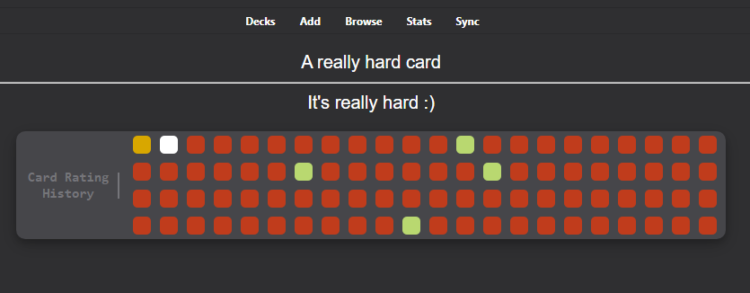
Newest update should truncate squares so it isn’t just a comically long line.
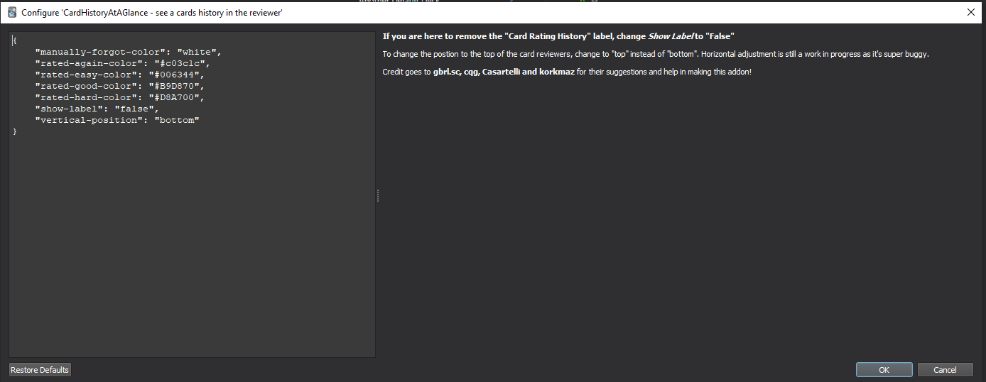
Also, I added korkmaz’s option in the config to adjust the location of the card rating tab to the top or the bottom. However, horizontal positioning is super buggy so I am still working on that  .
.
Lastly, I decided to only show the addon after the user clicks the “show-card” button. This is because it gives away too much context about the card and I think is what gbrl.sc originally intended.
I see the point, but is there any chance you can let the user choose?
In my case i would like to see before the user clicks the “show-card” button because, in certain cards, i have three ‘‘Back’’ extra fields where i put some extra information and sometimes that “extra information” is quite big, causing me to scroll all the way down to see the ratings.
Another solution would be the ratings, after the user clicks the “show-card” button, be placed first, right now they are placed after all the "Fields’'. I think that would be better 'cause don’t give additional informational as does simply showing before the user clicks the “show-card” button, as you mentioned.
Anyway, that’s just my personal opinion and needs, I’m sure regardless of the decision, the add-on will still be great.
Great point. Right now, if you go into the addon config and change “vertical-position” to “top”, I think it should use your idea of displaying the ratings at the top of the card. Tell me how it goes!
EDIT: Sorry, the addon is working great in 2.1.45. My fault 
PS: as a suggestion, it would be nice to have an “Off / On” option in the addon config, so the user can turn the feature on and off without the need of activate / deactivate the addon and restarting Anki
Haha no problem! If you do have any problems though, please be brutally honest! Some people on the reddit were finding it had some conflicts with their own card templates soI’m trying to find the most non-intrusive way to add the addon.
Hi @jerryzhou196
You’ve done a really good job. I can’t thank you enough for spending your time to implement this idea!
I see that there are some people using the addon already and they like the result. That’s great!
I also would like to thank you for mentioning my original post in the addon page.
So… let’s talk about the addon.
For starters, I’d like to give some suggestions, then I’ll share a tip about an “issue” I faced when I first installed the addon.
Suggestion #1: Pagination.
I like the way you solved the problem presented by @01101 by creating a box to contain the squares. However, I think that, as the number of reviews grow, this box will occupy too much space and then push the card information towards the bottom of the page (if the box is positioned in the top, of course  ).
).
A viable solution might be implementing pagination, like these exemples:
(Suggestion 1: Inspired by Glutanimate’s Review Heatmap style)

(Suggestion 2: Got from Pagination.js - Pagination.js | Home)
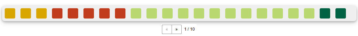
I particularly like the style from the first one, but think that it’s useful to know how many pages are there, like in the 2nd.
Maybe the user could be allowed to choose in the Config menu if s/he wants the squares to be displayed the way they are now or this one I’m suggesting.
Suggestion #2: Positioning.
I tried to set the addon to display the info between the back side card and the horizontal line that separates the Front side from the Back side, like this:

I managed to do this by replacing append and prepend with after and before (line 45 of _init_.py), append with after (line 79 of _init_.py) as well as replacing head with hr (line 78 of _init_.py)
The problem is that if I make this changes, the addon doesn’t show anything in Cloze notetype cards (I just tried with Basic and Cloze, btw). Is it possible to make it work for both cards?
Suggestion #3: Hide and show
I read in the comments that @cqg suggested that the addon had an On/Off option in the Config menu. I can think of three possible ways of implementing this.
1st. The html <details> element: let the user choose in the Config menu if it’s always open or not.
2nd. jQuery .toggle() effect.: let the user decide if this is “true” or “false” in the Config menu.
3rd. Change the opacity (set the default opacity to 0 then, when the user hover the mouse over the addon area, it turns to 1): Let the user choose in the Config if s/he wants the opacity to be always 1 or not.
Like this:

Well, those were my suggestions. Now, the tip.
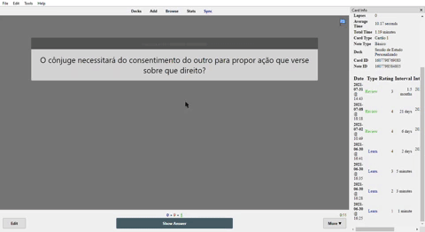
When I first installed the addon I noticed it displayed a weird behavior of not showing any square but showing just the label. (see below)
I first thought it must be a conflict with other addons, so I ran Anki with only this addon toggled enabled but nothing changed.
After that, I considered that the CSS modifications I made in my cards (+ some js from Bootstrap/Popper) might have something to do with this problem. That was the answer!
I just had to replace .tooltip and .tooltiptext in _init_.py with something else as I’m currently using Bootstrap’s tooltip component in my cards alongside with standard tooltip CSS (Bootstrap’s tooltip is labeled as .tooltip and .tooltiptext in Styling section while standard tooltip is .tooltip1 and .tooltiptext1).
So, if anyone else face something like this, they already know how to fix it.
1 Like
Are there any chances that you will find time to address the issues on github, any time soon?
I hope you are healthy.
1 Like
Hey! Thank you so much for reaching out! To be honest, I sort of fell off after college started, and never got back to developing Anki addons. However, now that you bring it up, I really miss it, and I will definitely try to get back into it. I’ll address the GitHub issues this week - and thank you so much for igniting the spark I’ve needed for a while now. Cheers!
1 Like
Up.
Anyone? Please.