Confusing answer comparison on AnkiMobile

Hi,

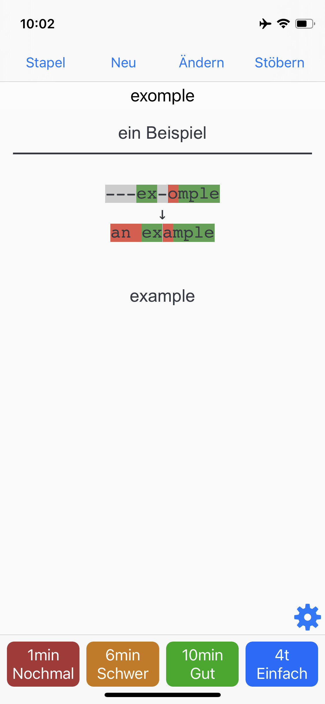
the answer comparison on AnkiMobile unfortunately does not work as well as on Anki Desktop.

In case of a typing error the “provided” and “correct” sections do not line up correctly.
The reason for this is that an additional “-” is added for each error and not only for missed characters.
Therefore the number of characters no longer matches.

Also the css classes “typeBad” and “typeMissed” seems to be swapped. The background colour of errors is grey not red and the background colour of missing characters is red not grey.

For me this is a bit confusing and I like the desktop version much better.

Is there a way to change this behaviour of AnkiMobile?

Thank you!
Janik

1 Like

I’m afraid not, but I’d like to unify the typing comparison implementations in the future, and I’ve made a note about this issue.

Here’s the piece of javascript that fixes the issue. Just add it to the bottom of your back template. This should replicate the bahavior of desktop anki

<script>
// remove all extra dashes
document.querySelectorAll('#typeans > .typegiven > .typeMissed + .typeBad').forEach(e => {
	for (var i=0; i<e.innerText.length; i++) {
		e.parentElement.removeChild(e.previousElementSibling)  
	}	
})// fix given
document.querySelectorAll('#typeans > .typegiven > .typeMissed').forEach(e => {
	e.classList.replace('typeMissed', 'typeBad')
})
// fix correct
document.querySelectorAll('#typeans > .typecorrect > .typeBad').forEach(e => {
	e.classList.replace('typeBad', 'typeMissed')
})
</script>