Thank you!
Is there a reason why in the back template the animation does not work without clicking the button, in contrast to the front template that the animation works when the card is opened?
The front of the card has a piece of code that starts the animation after the card loads (if it works for you this way, I suppose you still have it).
I did not put the same code for the buttons on the info screen, because it is not displayed right away when a card is flipped to reveal the backside. Instead, the front side is shown again first, with an answer colored according to its correctness:
(↑ this is technically the back of a card)
The info screen is already loaded at this point, but remains hidden until its appearance is triggered by a set timeout. If audio buttons on the info screen would start play on load as well, only the very end of the animation would be visible, which would look kinda awkward. Also, audio questions already have the animation of the central button replayed on a card flip, so having animations on the info screen on top of that would be redundant in that case.
Hello, is there a way to show the backside of the card in the multiple choice card type even when a correct answer has been given? I want to see the informations stored on the back, like the example sentence.
I’m also interested in this myself - I want to test myself on meaning + reading within the same card
I know this is a support thread but I can’t stop from giving out a huge thanks to Eltaurus. I quit Memrise years ago because of it’s crappy changes but I never stopped loving old Memrise. I’ve waited years for a good alternative that recreated the original feel. Thanks man seriously, I downloaded AnkiDroid and the desktop version just to get to use your template. Good work and thanks again!
Sure, you’ll just need to find the following piece of code on the back of the card

and replace the autorateGood(); action for correct cards with these three lines:
		wrap.classList.add("backside");
		wrap.classList.remove("frontside");
		flipBtn.onclick = autorateGood;
They toggle the info screen and set the autorate Good as the action for the next press of the ‘Enter’ key instead of executing it right away.
I don’t know, what exactly you have in mind, but maybe this method will work for you better?
It combines the simplicity of having only one note for each word with the minimum information principle, keeping each card efficient and straight to the point.
Thank you for the kind words. It wouldn’t make sense to pour time into developing and maintaining the template if people wouldn’t find it useful, and comments such as yours are the only way to see if that’s the case. Rest assured, they are always very much welcome in this thread. ![]()
Thank you so much! And again as everyone else has already said you have done a great job! (I eventually found the solution on my own literally 2 min before you posted and it took me… 2 hours ![]() I should have just waited for you to answer ahahah)
I should have just waited for you to answer ahahah)
Sorry for not answering sooner, I was away from the internet for the last several days. But finding a solution on your own is always worth it, I think, as it gives you a deeper understanding of the overall system and puts you in a better position for any possible future adjustments.
Part of the purpose of this thread is to showcase the flexibility of Anki in general, so that people would be able to personalize their cards further and in more ways than predefined settings of any template can cover on their own.
Is there a brief description of the fields used by the Memrise template and how to use them? Other than “choice”, I don’t see anything in this thread nor on github.
Thank you!
Edit: Or even a sample set of cards, like you show in the screenshots. So it would be possible to work out how the fields work.
Basically, {{Learnable}} - is the field for the info you are trying to learn (like a foreign word; the template is set up to expect it as an answer by default), {{Definition}} - is what that info is defined with (like the meaning of that word in a known language; this is what shows on a card as a question). {{Audio}} is audio (of a foreign word), and {{Extra}} + {{Extra 2}} are the fields for any other information you might want to put on a card. {{Mems}} and {{Attributes}} are not used in the current version of the templates and exist only as placeholders for the future.
However, the template is made flexible to be customised for any specific use. There are practically no limitations on what information can go in which field, for example, you can put audio into the {{Defintion}} field and it will work just as well, or put an image into {{Extra}} field an so on (the only restriction is that the field expected as an answer should only contain text – obviously, one cannot type an audio file or an image file with a keyboard, but images and audio are also not supported as options for multiple-choice (yet)).
On top of that, you can add, remove, and rename fields as you choose, change directions of testing and make new types of cards for different combinations of answer and question fields. There are several posts in this thread that detail some customization variants: such as adding new fields, adjusting labels, and adding more testing directions, changing question to audio on an existing card, or making new multiple-choice card (look under the relevant spoiler). Those should give a general idea of how each aspect of the template can be adjusted, but if you are looking for something specific, I can provide directions for that as well.
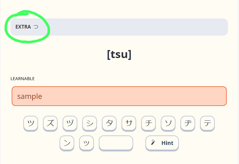
On your example template, for v3.32, card #3, the “Extra” field never shows up on the front card. Not even the label for the field.
I’m pretty sure it has something to do with the CSS, but don’t know how to track that inside of Anki.
This is the Anki desktop version for Linux, if that makes a difference.
I notice that the sample screen shots for this type do not show the extra field either.
Thank you!
It is there to be shown after an answer is submitted:
It also gets hidden, if the window width is not big enough, following the original Memrise behaviour.
Does it function for you any differently?
You can use this add-on for inspecting card’s css
Where can I read about known problems?
There are several bugs when using ankidroid, but if they are known, then I would prefer not to write about them.
The only android-specific issue in the v3.32 I am aware of is that it brings back a previously submitted answer when an empty answer is typed. The fix for it is already done and will be included in the next release.
In general, I suggest looking for known issues in the respective github section, and putting new ones there if they are definite bugs. Things, for which it isn’t as clear if they work as intended, as well as various feature requests are better to be discussed in this thread first.
After flipping through the topic, I realized that it is known about this:
AnkiDroid
If the answer is correct, “Extra” does not appear due to insufficient space. The response correction does not work when using the on-screen keyboard.

Right. But that’s not a bug, the template just follows the original Memrise behavior in this regard. If you want to change it, you can find the following part in the styling tab of your template and modify it accordingly:
@media (min-width: 33.25rem) {
  .card-content.front {
      grid-template-rows: 3.81rem;
  }
	.card-content {
	  padding-top: 2rem;
	}
}
the mid-width parameter defines the minimum width of a card required for the extra field to be displayed. Changing the number to something smaller will make it to be shown on narrower screens.
Also correct. This one wasn’t possible to fix in the previous template version because of an AnkiDroid bug. The next version I am working on right now will use a completely different typing system, which should make it platform-independent. Apart from fixing the aforementioned issue, it is supposed to become usable on iphones and also enable the creation of multiple-choice cards with image options.
An inscription appeared along with an empty space, because of which the card does not fit into the screen. The standard version is better then.
“Type the correct translation”
I think it’s better for me this way, if he doesn’t break anything, of course.
<div class="card-content front mch">
    <div class="overhead">
		   <div class="mem-instruction">
        Pick the correct answer
      </div>
			 {{#Extra}}
					<div class="front-extra">
						<label>Extra</label>
						<span>{{Extra}}</span>
					</div>
				{{/Extra}}
    </div>
 {{#Extra}}
		<div class="front-extra">
			<label>Extra</label>
			<span>{{Extra}}</span>
		</div>
{{/Extra}}
<div class="card-content front mch">
    <div class="overhead">
		   <div class="mem-instruction">
        Pick the correct answer
      </div>

    </div>
The template does not take into account large buttons, but this is to be expected.

If you are referring to the padding at the top, you can split the code above into two parts to modify only the min-width for the extra section:
@media (min-width: 33.25rem) {
  .card-content.front {
      grid-template-rows: 3.81rem;
  }
}
@media (min-width: 33.25rem) {
	.card-content {
	  padding-top: 2rem;
	}
}
What would taking into account look like in this context in your opinion?
It seemed to me that the template takes this into account and draws fewer buttons from random_keys. But now I see that this is not the case.

