I’m trying to have a footer with additional info at the bottom of the back card.
like this page: https://philipwalton.github.io/solved-by-flexbox/demos/sticky-footer/
I’m trying to use flexbox but cannot make it work, is it supported?
dae
August 31, 2020, 12:07am
2
If it’s supported in Chrome 57, then it should work in Anki.
https://caniuse.com/#feat=flexbox
It doest expand the card content…
Back template:
<body>
    <div class="card-content">
        <div>
            {{cloze:Text1}}
        </div>
    </div>
<div class="footer">
    <div>
        {{Source}}
        {{Tags}}
        Footer test Pellentesque habitant morbi tristique senectus et netus et malesuada fames ac turpis egestas. Vestibulum tortor quam, feugiat vitae, ultricies eget, temp
    </div>
</div>
</body>
CSS:
html, body {
  /* IE 10-11 didn't like using min-height */
  height: 100%;
}
body {
  display: flex;
  flex-direction: column;
}
.card-content {
  flex: 1 0 auto; /* Prevent Chrome, Opera, and Safari from letting these items shrink to smaller than their content's default minimum size. */
  padding: 20px;
  background: lightgray;
}
.footer {
  flex-shrink: 0; /* Prevent Chrome, Opera, and Safari from letting these items shrink to smaller than their content's default minimum size. */
  padding: 20px;
  background: gray;
}

* {
  box-sizing: border-box;
}
body {
  margin: 0;
  font: 16px Sans-Serif;
}

}
footer {
  background: #42A5F5;
  color: white;
}
This is how it renders in forefox:
And this is Anki:
You can see that in Anki, the main content doesn’t expand to push down the footer.
dae
August 31, 2020, 11:05pm
4
You’re not following the example you linked to - 100% is not the same as 100vh. The web toolkit is based on Chromium, so Chrome will likely give you closer results than Firefox.
The code renders fine on even Chrome, with both 100% and 100vh.
I think there is something about how Anki consider the Body element.
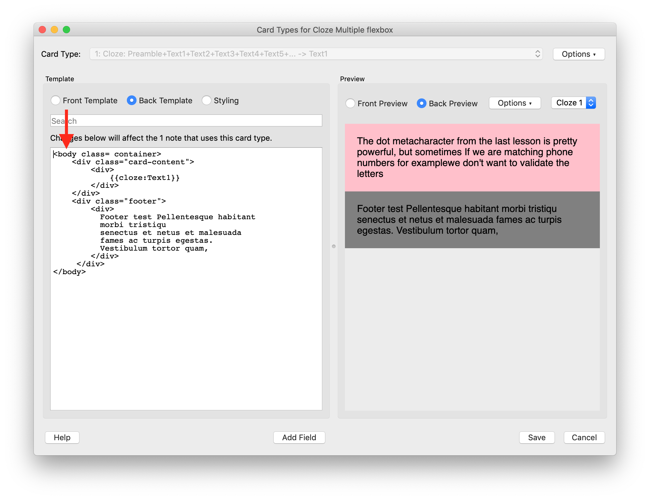
HTML:
<body class= container>
<div class="card-content">
    <div>
        {{cloze:Text1}}
    </div>
</div>
<div class="footer">
    <div>
      Footer test Pellentesque habitant
      morbi tristiqu
      senectus et netus et malesuada
      fames ac turpis egestas.
      Vestibulum tortor quam,
    </div>
 </div>
CSS:
body {
.container {
.card-content {
.footer {
footer {#42A5F5 ;
It doesn work:
But if I change the body tag to div, it works (with the same CSS):
Leaving the body tag as the top hierarchy tag, and putting the flex formatting directly under the body element, in CSS, doesn’t work either:
naming the top level “mycard” makes it work:
So, it just doesn’t like the
body element.
Where can I read about the structure of the underlining html that Anki uses?
For example, at what level is the the card class applied by Anki?
abdo
September 1, 2020, 12:19pm
6
You can use the AnkiWebView Inspector add-on to inspect the webviews.
thanks, that is very useful…
Ok, using the web Inspector add on, now is more clear:
it looks like everything
there are others div inside the body, so anything that is inheritable, like font size , colors, is ok to style into the body element in CSS.
Stuff that acts on layout might get problematic, as I experienced. <div id="qa"> highlighted):
@Liliumanki May I kindly ask for your final footer solution? Mine doesn’t work on mobile (iOS).
Thanks
Hi, I’m using this template at the moment:
Front:
<container class="card-container">

    <content class= "card-content">
        {{#preamble}}
            <div class= "note-subject" > {{preamble}} <br> <br> </div>
        {{/preamble}}
        {{cloze:text1}}
        {{cloze:text2}}
        {{cloze:text3}}
        {{cloze:text4}}
        {{cloze:text5}}
        {{cloze:text6}}
        {{cloze:text7}}
        {{cloze:text8}}
        {{cloze:text9}}
        {{cloze:text10}}
        {{cloze:text11}}
        {{cloze:text12}}
        {{cloze:text13}}
        {{cloze:text14}}
        {{cloze:text15}}
        {{cloze:text16}}
        {{cloze:text17}}
        {{cloze:text18}}
        {{cloze:text19}}
        {{cloze:text20}}
        {{cloze:text21}}
        {{cloze:text22}}
        <hr>

    </content>

</container>
Back html:
<container class="card-container">

    <content class= "card-content">
        {{#preamble}}
            <div class= "note-subject" > {{preamble}} <br> <br> </div>
        {{/preamble}}
        {{cloze:text1}}
        {{cloze:text2}}
        {{cloze:text3}}
        {{cloze:text4}}
        {{cloze:text5}}
        {{cloze:text6}}
        {{cloze:text7}}
        {{cloze:text8}}
        {{cloze:text9}}
        {{cloze:text10}}
        {{cloze:text11}}
        {{cloze:text12}}
        {{cloze:text13}}
        {{cloze:text14}}
        {{cloze:text15}}
        {{cloze:text16}}
        {{cloze:text17}}
        {{cloze:text18}}
        {{cloze:text19}}
        {{cloze:text20}}
        {{cloze:text21}}
        {{cloze:text22}}
        <hr>

        {{#note-meta}}
            <div class= "metanote" > ! {{note-meta}} ! </div>
            <br>
        {{/note-meta}}

        {{#mnemonic}}
            <div class= "panel">
                <div class="label-mnemo"> mnemo: </div>
                <div class="mnemonic"> {{mnemonic}} </div>
            </div>
            <br>
        {{/mnemonic}}

       {{#extra-info}}
            <div class= "panel">
                <div class="label-extra-sx"> extra: </div>
                <div class="extra-info"> {{extra-info}} </div>
                <div class="label-extra-dx"> </div>
            </div>
        {{/extra-info}}

        {{#note-link}}
            <div class= "panel">
                <div class="label-extra-sx"> links: </div>
                <div class="note-link"> {{note-link}} </div>
            </div>
        {{/note-link}}

        {{#image}}
            <br>
            <div class="image"> {{image}} </div>
        {{/image}}
    </content>

    <footer class= "footer" >
        {{#source}}
            <div class= "panel">
                <div class="label-footer"> Fonte: </div>
                <div class="source"> {{source}} </div>
            </div>
        {{/source}}

        {{#Tags}}
            <div class= "panel">
                <div class="label-footer"> Tags: </div>
                <div class="tags"> {{Tags}} </div>
            </div>
        {{/Tags}}
    </footer>

</container>
CSS:
/* -------------- CSS Variables ---------------- */

:root {

    --footer-height:         4em;
    --padding-from-label:    0.5rem;
    --label-width:           3.3rem;

    --mmemo-line-height:     14px;
    --note-link-line-height: 14px;

    --base03:           #002b36;
    --base02:           #073642;
    --base01:           #586e75;
    --base00:           #657b83;
    --base0:            #839496;
    --base1:            #93a1a1;
    --base2:            #eee8d5;
    --base3:            #fdf6e3;
    --solar-yellow:     #b58900;
    --solar-orange:     #cb4b16;
    --solar-red:        #dc322f;
    --solar-magenta:    #d33682;
    --solar-violet:     #6c71c4;
    --solar-blue:       #268bd2;
    --solar-cyan:       #2aa198;
    --solar-green:      #859900;


    --color-emphasis:       var(--base01);
    --color-primary:        var(--base00);
    --color-secondary:      var(--base1);
    --color-background-hi:  var(--base2);
    --color-background:     var(--base3);
    --color-accent-main:    var(--solar-orange);
    --color-accent-bold:    var(--solar-blue);
    --color-accent-italic:  var(--solar-green);

}


/* ----------- CSS ANKI -------------- */

.card {
    lang: "it";
    hyphens: none;
    font-family: "Fira Sans", Verdana, sans-serif;
    font-size: 20px;
    font-weight: 400;
    color: var(--color-primary);
}

b {
    color: var(--color-accent-bold);
}

i {
    color: var(--color-accent-italic);
}


.cloze {
    font-size: 20px;
    font-weight: bold;
    color: var(--color-accent-main);
}

.cloze b {
    color: var(--color-accent-main);
}

body {
    hyphens: none;
    margin: 0;
    text-align: left;
}


/* ---------------- CSS card layout ---------------- */

.card-container {
    display: flex;
    flex-direction: column;
    justify-content: space-between;
    min-height: 100vh;
    background-color: var(--color-background);
}

.card-content {
    flex: 1;
    padding: 6% 12% 2% 12%;
}

.footer {
    background: var(--color-background-hi);
    padding: 1% 12%;
}


/* ------- Flexbox extras ------- */

.panel { /* -- to contain the label and the additional info in flexbox */
    display: flex;
    flex-direction: row;
}

.panel:first-of-type { /* -- space between two contiguous panels */
    padding-bottom: 1.5%;
}

.label-mnemo {
    font-size: 14px;
    line-height: var(--mmemo-line-height);
    color: var(--color-secondary);
    padding-left: 1%;
    min-width: var(--label-width);
}

.label-footer {
    font-size: 14px;
    color: var(--color-secondary);
    padding-left: 1%;
    min-width: var(--label-width);
}

.mnemonic {
    font-family: "menlo","Lucida Console", monospace;
    line-height: var(--mmemo-line-height);
    padding: 0 var(--padding-from-label);
    font-size: 14px;
    color: var(--solar-cyan);
}

.label-extra-sx {
    font-size: 16px;
    font-style: italic;
    color: var(--color-secondary);
    background: var(--color-background-hi);
    padding-left: 1%;
    min-width: var(--label-width);
}

.label-extra-dx { /* -- spacer to center extra info -- */
    font-size: 16px;
    font-style: italic;
    min-width: 3rem; /* -- in rem for consistency with ".footer .label" */
}

.extra-info {
    font-size: 16px;
    color: var(--color-primary);
    padding: 0 var(--padding-from-label);
    flex-grow: 1; /* ensures it grows to fill the rest of card width left by label, important if short text is centered */
}

.source {
    color: var(--color-primary);
    font-size: 14px;
    padding: 0 var(--padding-from-label);
}

.tags {
    word-spacing: 2em;
    font-size: 14px;
    padding: 0 var(--padding-from-label);
}


/* --------------- CSS card elements ----------------- */

.note-subject {
    font-size: 22px;
    font-weight: bold;
    color: var(--color-emphasis);
    text-decoration-line: none;
    text-decoration-style: double;
    text-decoration-color: var(--color-secondary);
}

.metanote {
    font-size: 14px;
    font-weight: bold;
    color: var(--solar-red);
    animation: flash 1s linear infinite; /* adds animation */
}

@keyframes flash { /* animation parameters */
  50% {
    opacity: 0;
  }
}

.image {
    font-size: 14px;
    font-weight: bold;
    color: var(--color-secondary);
}

.note-link {
    padding: 1% var(--padding-from-label);
    font-size: 14px;
    line-height: var(--note-link-line-height);
    text-align: left;
    color: var(--color-secondary);
}

a {
    color: var(--solar-blue);
    text-decoration: none;
}

img {
    display: block; /* necessary to set width images which are inline together with text */
    max-width: 100%; /* fills the card */
    max-height: 90vh; /* avoid images too long */
    margin: auto; /* centers the image in its container */
}

ul, ol {
    text-align: left;
    display: block;
    margin-top: 0.4rem;
    margin-bottom: 1rem;
    padding-left: 3rem;
}

ul li, ol li {
    margin-bottom: 0.3em;
}

ul ul, ol ol {
    margin-top: -0.3em;
    margin-bottom: 0.5em;
}

ul ul li, ol ol li {
    margin-top: 0em;
    margin-bottom: 0em;
}

hr {
    height: 3px;
    background-color: var(--color-background-hi);
    border: none;
    margin-top: 8%;
    margin-bottom: 7%;
}

table {
  border-collapse: collapse;
}

table, th, td {
  border: 1px solid var(--color-secondary);
}
Hope it works for you!
Thank you, I try to make a simple footer from it.
Thank you very much, I was having the same problem.