Through the official template, I’m having a hard time learning to make a picture occlusion template with special actions. So I often ask questions recently.
Here are the questions:
How can I widen the image and extend it to the left and right sides of the screen?
You can tell me a solution, and I’ll study.
Description of the problem:
There is only one picture in the {{picture}} field.
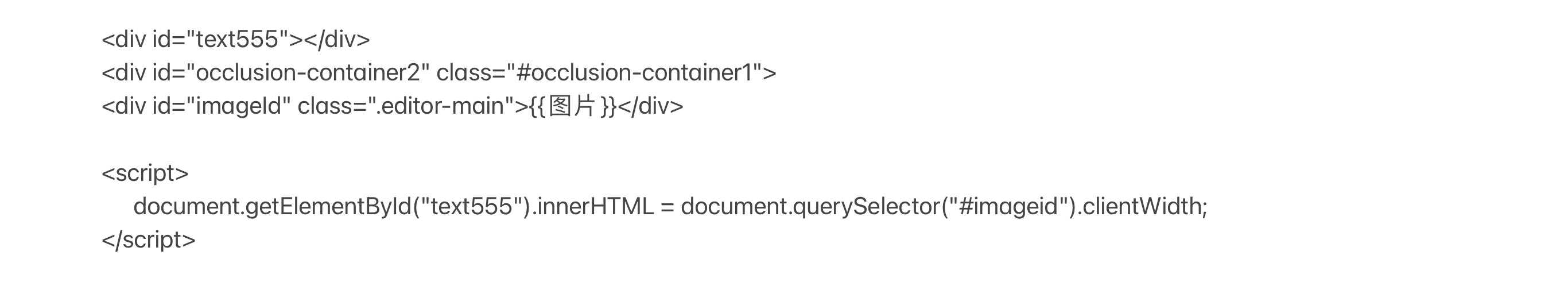
The following is the front template and css content.
Pictures can’t be all over the screen.
The naturalWidth of the image is 500.
The width displayed on the screen is 1336.
And the width of ipad’s screen is 2732.
o(∩_∩)o
I don’t know how to send the code. My settings are as described in the picture.
Thank you, Dae.
I have figured out the flow chart of my picture occlusion now.
If there is no step of adapting the image to the screen, the progress of making JS will be faster.
I’m going to use the official graphic occlusion template to set the field information, and then I’ll set the JS action to use it with the handle.
Thank you and other supporters for your great contribution to ankimobile.


