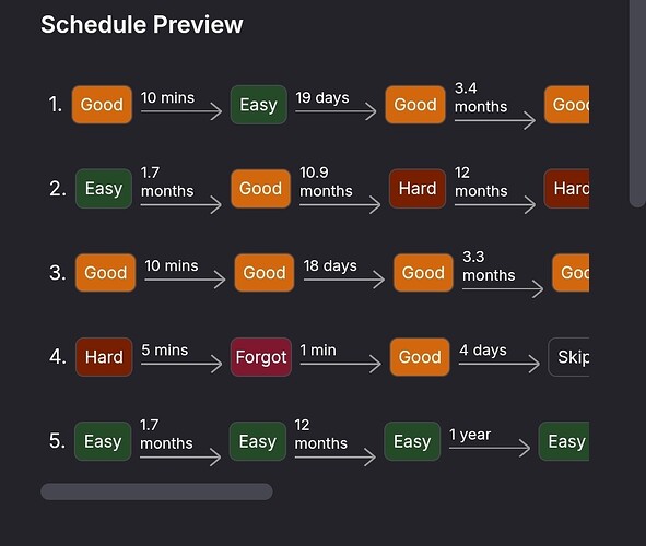
So how would the intervalls from the button version (or good-sequence version) be chosen? Are they just based on a general rule to give the user an idea? If so, is there a general statement that the user could use as a guide, like this?:
They are calculated using FSRS formulas, same as when you are, well, actually using FSRS.
You change DR - intervals change
You change parameters - intervals change
Btw, here’s an “ankified” version
I really like this one. It obviously still has the flaw I mentioned in #1 above, but I think it gives a good overview and is easy to understand.
This would be a disaster, and new users would end up undervaluing DR. They would probably end up thinking DR doesn’t affect how much they remember or that they can choose whatever value they wish to.
I didn’t knew this was posted a year ago.
Not to mention that precisely controlling the review load is MUCH harder than precisely controlling retention.
cursed idea: make each of those “good” buttons actually a dropdown with hard/good/easy and let the user play around it (default it to good/good/good).
I think I was talking about removing DR though? Not sure now how that would be a good idea.
The other part of the idea sounds good. A lot of apps, including some “competitors” (other educational apps) have personalisation flows where you can select things like “How much time do you want to spend everyday?” You can hopefully set up the user with good enough deck option settings by asking these questions.
I was actually considering that.
Maybe clicking on the button could switch it. E.g. if the button currently shows Good, then clicking on it would change the button to Easy (then to Again, ect.).
I wanted to propose a way for users to play around with it as well, but then wasn’t so sure if this idea would be accepted – it might be a feature that would create quite a bit of code (and thus maintainance burden), which might not be desired for something that most users either don’t see or don’t use (or just use for a short time, like 30 seconds).
Yeah, switching the button by clicking on it sounds good, but probably too much effort for something only a small number of users will appreciate. I guess it could be added later, if there is enough demand.
Maybe I’m wrong but that would make Anki not only feel cheap and basic but it seems kinda off too and would have negative effect on Anki’s image. To put it into perspective it’s like Photoshop (Anki) Vs Picsart (apps like Duolingo etc.).
What about making these buttons “less fake”: when you click on one of them it would update the intervals to what they would be in the next review, and a reset button would appear.
I don’t get it. Can you explain what you mean?
If you mean that clicking on these fake buttons would somehow affect your real cards - no, absolutely not.
I think ZornHadNoChoice meant the following:
- The options screen shows the four answer buttons (again to easy).
- Those buttons start with the interval of a new card.
- The user presses one of the four buttons.
- The buttons update and now show the interval, that the user would have if he studied that card again (when it’s due).
- The user can press the buttons again in any combination they want (and the intervals update accordingly).
- When the user wants to start over, they press a reset button.
That’s exactly what I meant. I couldn’t have said that more clearly.
Re BrayanDSO:
Off topic, but are those the actual intervals? They seem excessive (though maybe it’s the same with FSRS. I just don’t know because I hide the intervals above the answer buttons by default).
RemNote integrated FSRS-4.5 according to GitHub - open-spaced-repetition/awesome-fsrs: A curated list of awesome FSRS implementations, papers and resources
Their 1.16 release notes said it’s not default yet, you have to turn it on manually (which Brayan probably did)
I don’t know if i’m missing something because I haven’t read this entire thread, but these solutions seem very inefficient to me. The goal is to get the user to understand that desired retention will affect intervals. If this wasn’t a problem in the original SM-2 algorithm where there is the interval modifier, then this is just a problem of phrasing.
Instead of adding an out of place UI element which may or may not work to help beginners understand, I think changing the wording would make much more sense…
Maybe something like changing the text from “Desired Retention” to “Desired retention (affects intervals)” and making it clearer that clicking the text opens a window explaining exactly what desired retention does would be a better solution.
And although i’m not super active on the Anki forum or reddit, I do read quite a bit and this doesn’t seem to be that big of an issue. Even if people don’t understand it, does it really make a meaningful difference? The much bigger issue by a massive margin would be hard misuse IMO.
I also think that making the manual more accessible would probably help too. Right now you either have to google it or go to Help → Guide to find it. I think adding it at the bottom of the main screen makes a lot of sense.


